


- Förgör denna galna best Poster
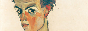
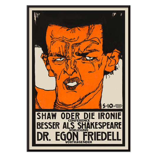
- Shaw or Irony Poster
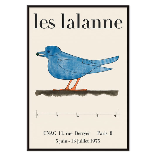
- Les Lalanne Poster
- Punch Boutique Poster
- Dansande par i snön Poster
- Jet Clipper till Hawaii Poster
- Campari Soda Poster
- Bec-Kina Poster
- Kohler Chocolat Poster
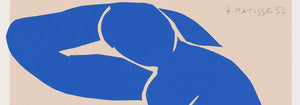
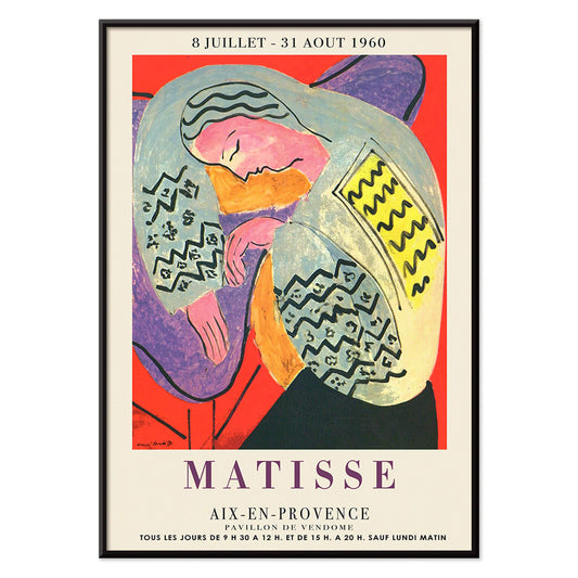
- Matisse Dansande Figurer Poster
- Tom Krojer utställningsposter Poster
- Berlin gatubild Poster
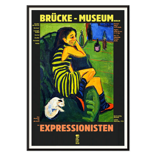
- Ernst Kirchner-utställning Poster
- Sittande kvinna bakifrån Poster
- Rött hår blå hatt Poster
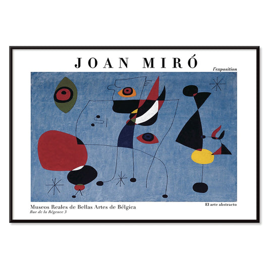
- El Comienzo Poster
- Parler Seul 2 Poster
- Mahatmas nuvarande ståndpunkt Poster
- Skymningens ring Poster
- Parler Seul Poster
- Faun och Nymf Poster
- Dröm Poster
- Le Concert Poster
- Fågel som passerar ett moln Poster
- Kvinnoporträtt Poster
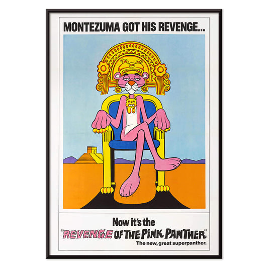
- Den rosa panterns hämnd Poster
- Kvinna och fågel om natten Poster
- Riley Blaze Poster
- Besök Puerto Rico Poster
- Almanaque Poster
- Ät mer frukt Poster
- The Jefferson Airplane Poster
- Snoopy Come Home Poster
- Till London med Jet Clipper Poster
- Kyushu-Okinawa Poster
- Xerez Pedro Domecq Poster
- Balsam Aperitif Poster
-
Förgör denna galna best Poster
Harry Ryle Hopps · 1917 · Dramatiskt krigstidsposter med hjälmförsedd gorilla som avancerar med klubba och fånge
Poster från 102 kr · Inramad från 181.33 kr
Ordinarie pris Från 68.00 krOrdinarie pris -
Shaw or Irony Poster
Egon Schiele · 1910 · expressiv poster med kantig figur, svart linjeföring och orange accenter
Poster från 102 kr · Inramad från 181.33 kr
Ordinarie pris Från 68.00 krOrdinarie pris -
Les Lalanne Poster
François-Xavier Lalanne · 1975 · minimal utställningsposter med en stiliserad blå fågel mot varm beige bakgrund
Poster från 102 kr · Inramad från 181.33 kr
Ordinarie pris Från 68.00 krOrdinarie pris -
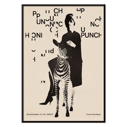
Punch Boutique Poster
Paul Mitzkat · 1950 · Vitsigt svart och beige poster med en elegant kvinna bredvid en zebra
Poster från 102 kr · Inramad från 181.33 kr
Ordinarie pris Från 68.00 krOrdinarie pris -
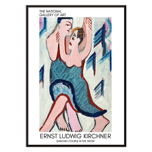
Dansande par i snön Poster
Ernst Ludwig Kirchner · 1928 · expressionistiskt konsttryck med ett dansande par i ett livfullt snölandskap
Poster från 102 kr · Inramad från 181.33 kr
Ordinarie pris Från 68.00 krOrdinarie pris -
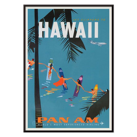
Jet Clipper till Hawaii Poster
okänd konstnär · 1950 · mitten av 1900‑talets hawaiiposter som förenar flygglans med solvarmt öliv
Poster från 102 kr · Inramad från 181.33 kr
Ordinarie pris Från 68.00 krOrdinarie pris -
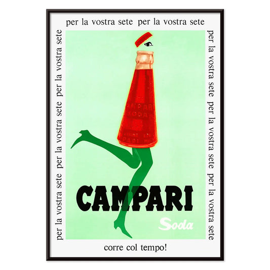
Campari Soda Poster
Okänd konstnär · 1932 · lekfull Campari Soda-affisch med promenerande flaska mot djup svart bakgrund
Poster från 102 kr · Inramad från 181.33 kr
Ordinarie pris Från 68.00 krOrdinarie pris -
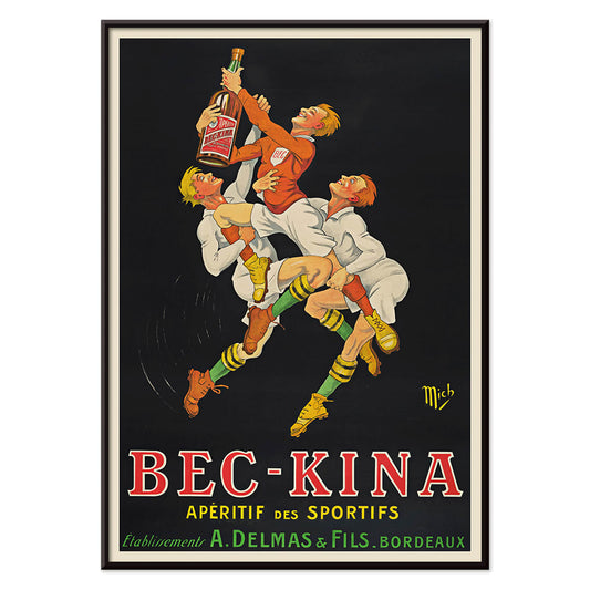
Bec-Kina Poster
Michel Liebeaux · 1900 · Energiskt rugbyinspirerat aperitifaffisch med kraftfulla figurer som når efter en flaska
Poster från 102 kr · Inramad från 181.33 kr
Ordinarie pris Från 68.00 krOrdinarie pris -
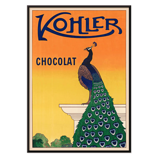
Kohler Chocolat Poster
F. Champenois · 1914 · elegant Art Nouveau-poster med en påfågel som reklam för Kohler-choklad i strålande orange bakgrund
Poster från 102 kr · Inramad från 181.33 kr
Ordinarie pris Från 68.00 krOrdinarie pris -
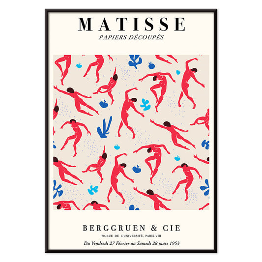
Matisse Dansande Figurer Poster
Henri Matisse · 1909 · dynamisk poster med dansande figurer i starka röda silhuetter mot djupt blått
Poster från 102 kr · Inramad från 181.33 kr
Ordinarie pris Från 68.00 krOrdinarie pris -
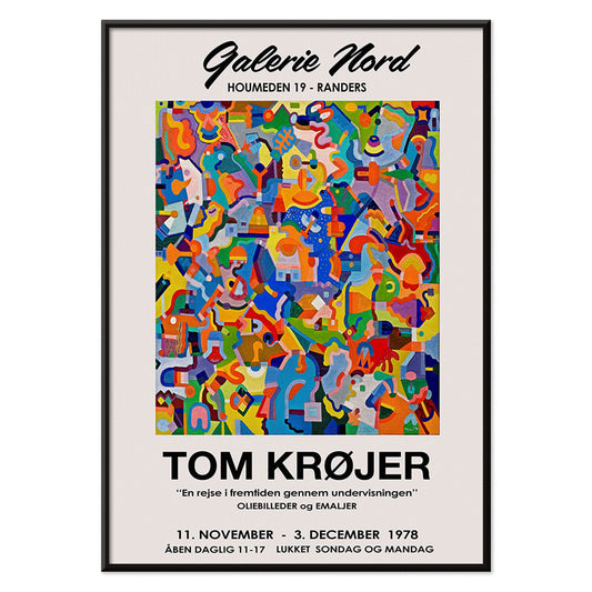
Tom Krojer utställningsposter Poster
Tom Krojer · 1989 · dynamisk geometrisk utställningsposter med livfulla färgblock och skarp modern typografi
Poster från 102 kr · Inramad från 181.33 kr
Ordinarie pris Från 68.00 krOrdinarie pris -
Berlin gatubild Poster
Ernst Kirchner · 1913 · dynamisk berlin poster med kantiga figurer, klara färgfält och nattlivsenergi
Poster från 102 kr · Inramad från 181.33 kr
Ordinarie pris Från 68.00 krOrdinarie pris -
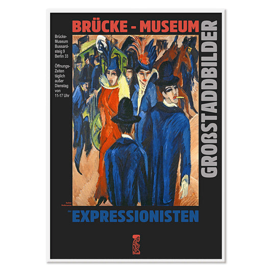
Ernst Kirchner-utställning Poster
Ernst Kirchner · 1910 · expressionistisk nakenposter med kraftiga svarta konturer och livfulla blå och röda färger
Poster från 102 kr · Inramad från 181.33 kr
Ordinarie pris Från 68.00 krOrdinarie pris -
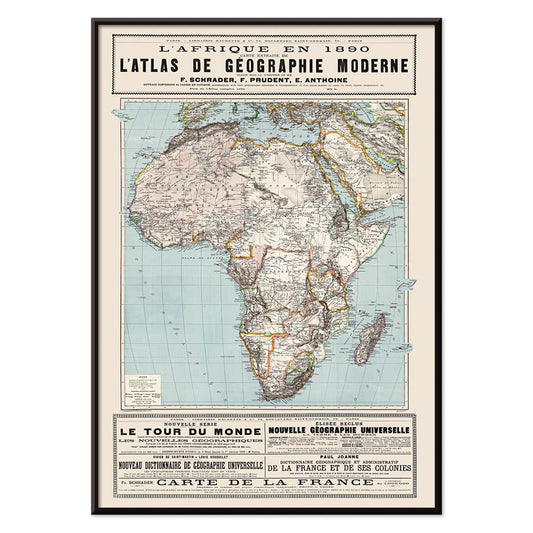
L'Afrique en 1890 Poster
Okänd konstnär · 1890 · Detaljerad karta över Afrika med franska etiketter och tidsenliga gränsmarkeringar
Poster från 102 kr · Inramad från 181.33 kr
Ordinarie pris Från 68.00 krOrdinarie pris -
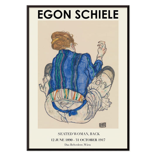
Sittande kvinna bakifrån Poster
Egon Schiele · 1917 · expressivt figurtryck med sittande kvinna sedd bakifrån i jordnära toner
Poster från 102 kr · Inramad från 181.33 kr
Ordinarie pris Från 68.00 krOrdinarie pris -
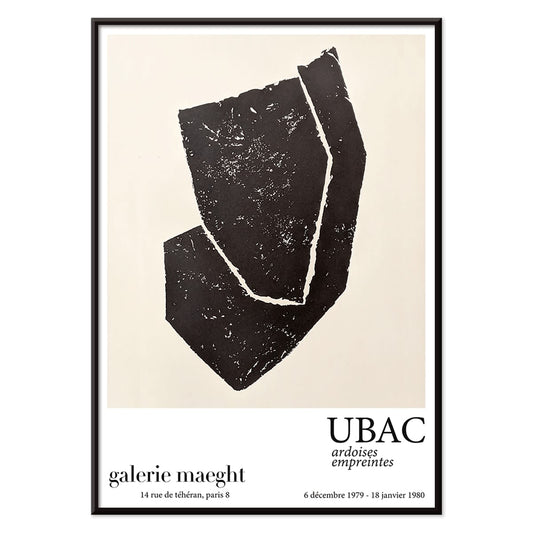
Ardoises Empreintes Poster
Raoul Ubac · 1979 · abstrakt poster med ingraverade skifferstrukturer, skuggiga organiska former och poetisk närvaro
Poster från 102 kr · Inramad från 181.33 kr
Ordinarie pris Från 68.00 krOrdinarie pris -
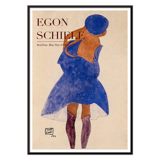
Rött hår blå hatt Poster
Egon Schiele · 1908 · Expressivt porträttkonsttryck med flammande rött hår och en sval blå hatt
Poster från 102 kr · Inramad från 181.33 kr
Ordinarie pris Från 68.00 krOrdinarie pris -
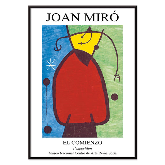
El Comienzo Poster
Joan Miró · 1972 · lekfull abstrakt poster med biomorfa former och kraftiga linjer i livfulla primärfärger
Poster från 102 kr · Inramad från 181.33 kr
Ordinarie pris Från 68.00 krOrdinarie pris -
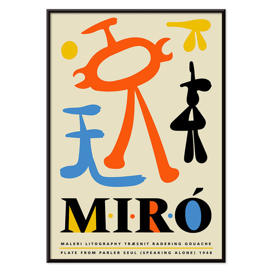
Parler Seul 2 Poster
Joan Miró · 1948 · lekfullt biomorf poster med svävande svarta linjer och orange, blått, gult på beige
Poster från 102 kr · Inramad från 181.33 kr
Ordinarie pris Från 68.00 krOrdinarie pris -
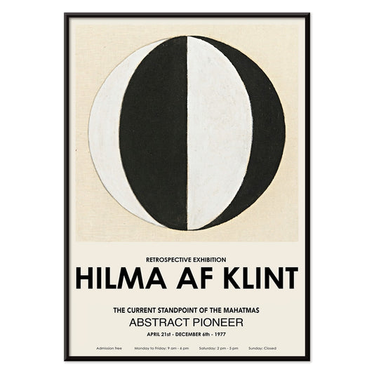
Mahatmas nuvarande ståndpunkt Poster
Hilma Af Klint · 1920 · Geometriskt konsttryck med cirklar och trianglar i tydlig svartvit symmetri
Poster från 102 kr · Inramad från 181.33 kr
Ordinarie pris Från 68.00 krOrdinarie pris -
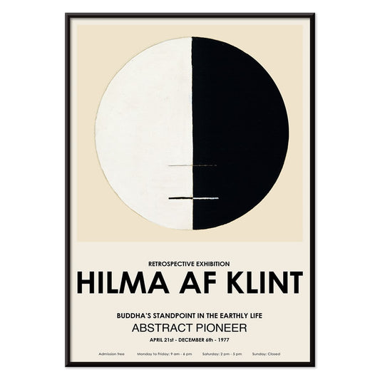
Buddhas ståndpunkt i det jordiska livet Poster
Hilma af Klint · 1917 · Meditativt konsttryck med buddhistiska symboler i en lugn cirkulär komposition
Poster från 102 kr · Inramad från 181.33 kr
Ordinarie pris Från 68.00 krOrdinarie pris -
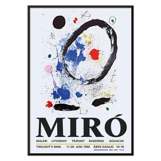
Skymningens ring Poster
Joan Miró · 2018 · Lekfull abstrakt poster med orbitande former och stjärnliknande märken i djup blått
Poster från 102 kr · Inramad från 181.33 kr
Ordinarie pris Från 68.00 krOrdinarie pris -
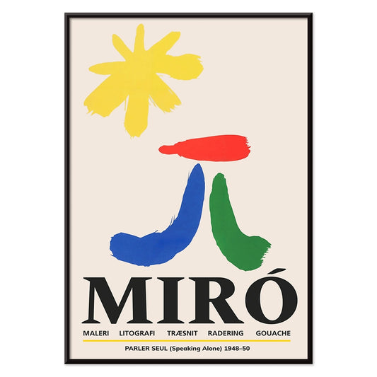
Parler Seul Poster
Joan Miró · 1948 · Lekfull abstrakt poster med flytande symboler, kraftfulla linjer och primärfärger
Poster från 102 kr · Inramad från 181.33 kr
Ordinarie pris Från 68.00 krOrdinarie pris -
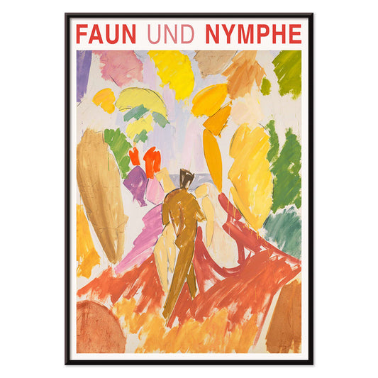
Faun och Nymf Poster
Edvard Weie · 1941 · Uttrycksfull modernistisk poster med faun och nymf i djärva färgblock
Poster från 102 kr · Inramad från 181.33 kr
Ordinarie pris Från 68.00 krOrdinarie pris -
Dröm Poster
Henri Matisse · 1960 · dröm poster med färgstark sovande figur, svepande konturer och platta färgfält
Poster från 102 kr · Inramad från 181.33 kr
Ordinarie pris Från 68.00 krOrdinarie pris -
Le Concert Poster
Hulusi Mercan · 1960 · Energiskt abstrakt poster med musikaliska instrument i starka röda, blå och gula former
Poster från 102 kr · Inramad från 181.33 kr
Ordinarie pris Från 68.00 krOrdinarie pris -
Fågel som passerar ett moln Poster
George Braque · 1957 · abstrakt fågelposter som driver genom ett moln med klara svarta linjer på varm gul
Poster från 102 kr · Inramad från 181.33 kr
Ordinarie pris Från 68.00 krOrdinarie pris -
Kvinnoporträtt Poster
Ernst Ludwig Kirchner · 1910 · vinklad figur i konsttryck med kraftiga svarta konturer och högkontrastfärger
Poster från 102 kr · Inramad från 181.33 kr
Ordinarie pris Från 68.00 krOrdinarie pris -
Den rosa panterns hämnd Poster
Okänd konstnär · 1978 · Lekfull filmaffisch med rosa pantern i majestätisk tronpose och starka retrofärger
Poster från 102 kr · Inramad från 181.33 kr
Ordinarie pris Från 68.00 krOrdinarie pris -
Kvinna och fågel om natten Poster
Joan Miró · 1947 · lekfull surrealistisk poster i midnattsblått med röda och gula accenter
Poster från 102 kr · Inramad från 181.33 kr
Ordinarie pris Från 68.00 krOrdinarie pris -
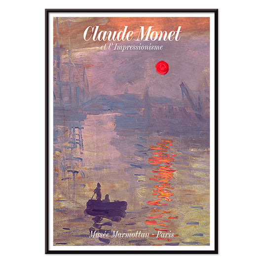
Soleil Levant Poster
Claude Monet · 1872 · dimhöljd hamn vid soluppgång med orange sol och blågråa vattenreflektioner
Poster från 102 kr · Inramad från 181.33 kr
Ordinarie pris Från 68.00 krOrdinarie pris -
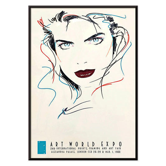
Metropolis Julie Poster
Dennis Mukai · 1988 · Djärvt kvinnoporträtt i svart, rött och blått med stadens nattenergi
Poster från 102 kr · Inramad från 181.33 kr
Ordinarie pris Från 68.00 krOrdinarie pris -
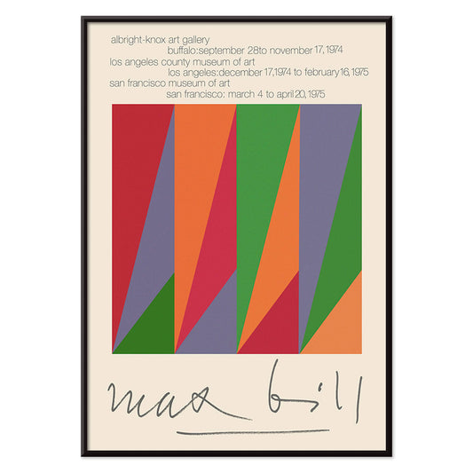
Max Bill Poster
Max Bill · 1974 · Geometrisk abstrakt poster med sammanlänkade former i klart rött, orange, grönt och lila
Poster från 102 kr · Inramad från 181.33 kr
Ordinarie pris Från 68.00 krOrdinarie pris -
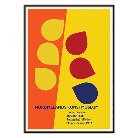
Ib Geertsen Poster
Ib Geertsen · 1982 · färgstark geometrisk poster med tydliga primära fält och nordisk modernism
Poster från 102 kr · Inramad från 181.33 kr
Ordinarie pris Från 68.00 krOrdinarie pris -
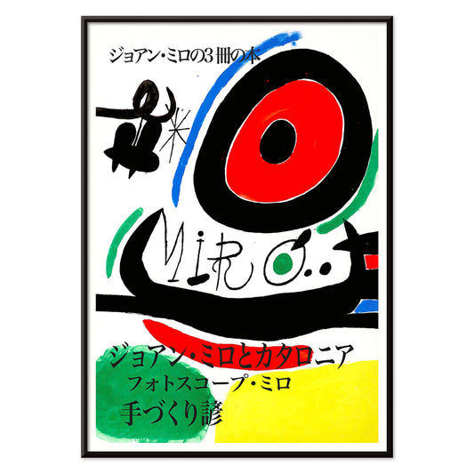
Joan Miro Osaka Poster
Joan Miro · 1970 · lekfull abstrakt poster med kalligrafiska svarta former och klara primärfärger
Poster från 102 kr · Inramad från 181.33 kr
Ordinarie pris Från 68.00 krOrdinarie pris -
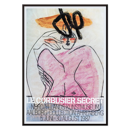
Hemlighet Poster
Le Corbusier · 1987 · Hemlighet abstrakt poster med starka svarta linjer och rosa, orange och blå block
Poster från 102 kr · Inramad från 181.33 kr
Ordinarie pris Från 68.00 krOrdinarie pris -
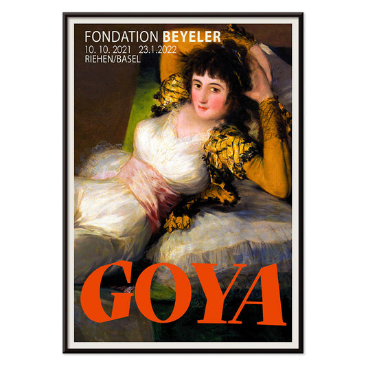
Den klädda Maja Poster
Francisco Goya · 1802 · ikoniskt liggande porträtt i klara vita toner, grönt sidenband och gyllene kuddar
Poster från 102 kr · Inramad från 181.33 kr
Ordinarie pris Från 68.00 krOrdinarie pris -
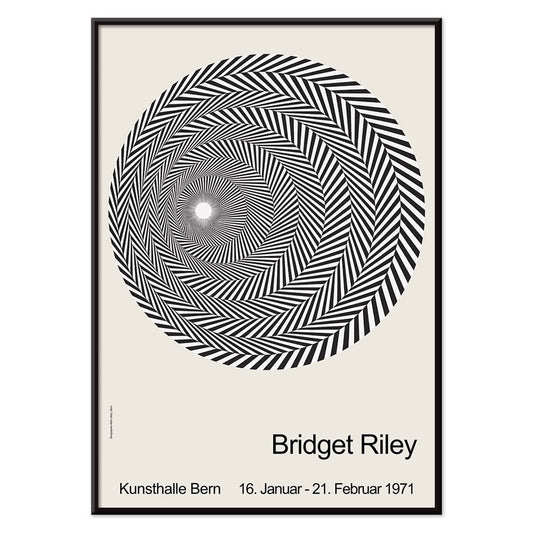
Riley Blaze Poster
Bridget Riley · 1964 · Hypnotisk svartvit op art poster med böljande band som ser ut att pulsera
Poster från 102 kr · Inramad från 181.33 kr
Ordinarie pris Från 68.00 krOrdinarie pris -
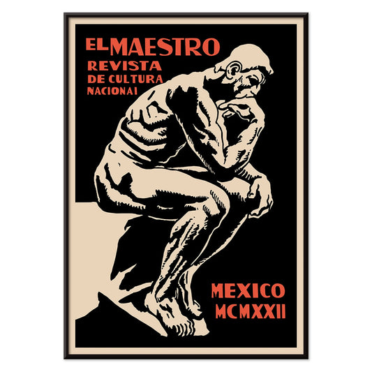
El Maestro 3 Poster
okänd konstnär · 1921 · grafisk pedagogisk affisch med monumental skrivare i svart, beige och rött
Poster från 102 kr · Inramad från 181.33 kr
Ordinarie pris Från 68.00 krOrdinarie pris -
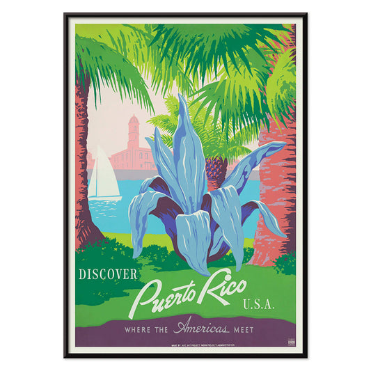
Besök Puerto Rico Poster
Okänd konstnär · 1950 · 1950-talets Puerto Rico-poster med segelbåt, historiskt kustfort och maritim charm
Poster från 102 kr · Inramad från 181.33 kr
Ordinarie pris Från 68.00 krOrdinarie pris -
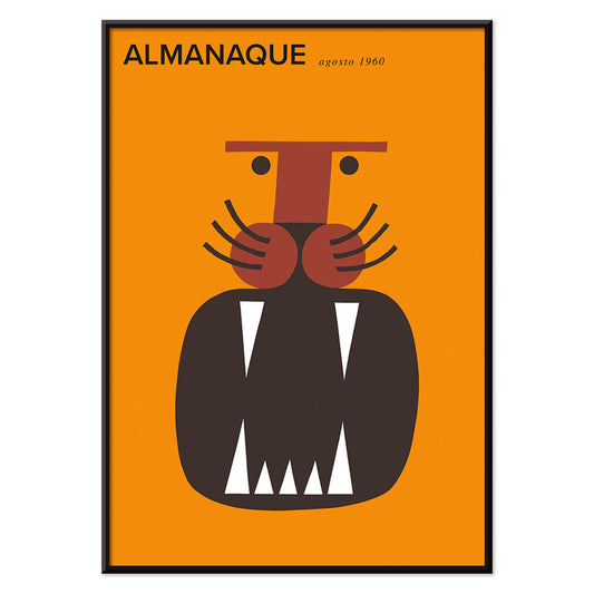
Almanaque Poster
Sebastiao Rodrigues · 1960 · abstrakt lejonposter i kraftfull orange och svart geometri i midcenturystil
Poster från 102 kr · Inramad från 181.33 kr
Ordinarie pris Från 68.00 krOrdinarie pris -
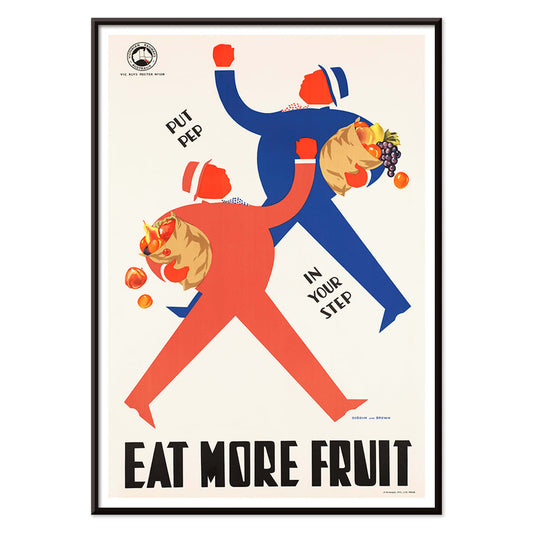
Ät mer frukt Poster
okänd konstnär · 1950 · glädjefull folkhälsoposter med stiliserade shoppare och fulla fruktkorgar i köket
Poster från 102 kr · Inramad från 181.33 kr
Ordinarie pris Från 68.00 krOrdinarie pris -
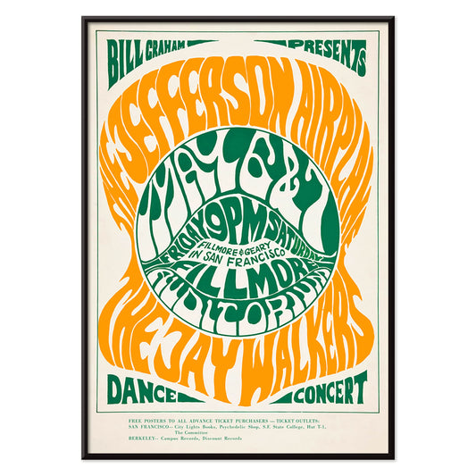
The Jefferson Airplane Poster
Wes Wilson · 1966 · psykedelisk The Jefferson Airplane-poster med svepande typografi och stark grön orange kontrast
Poster från 102 kr · Inramad från 181.33 kr
Ordinarie pris Från 68.00 krOrdinarie pris -
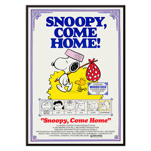
Snoopy Come Home Poster
okänd konstnär · 1972 · glädjefylld Snoopy och Woodstock poster med rena linjer och klara primärfärger
Poster från 102 kr · Inramad från 181.33 kr
Ordinarie pris Från 68.00 krOrdinarie pris -
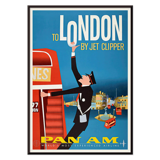
Till London med Jet Clipper Poster
okänd konstnär · 1955 · mitt i 1950-talets londonposter med Pan Am-stewardessa och röd dubbeldeckarbuss
Poster från 102 kr · Inramad från 181.33 kr
Ordinarie pris Från 68.00 krOrdinarie pris -
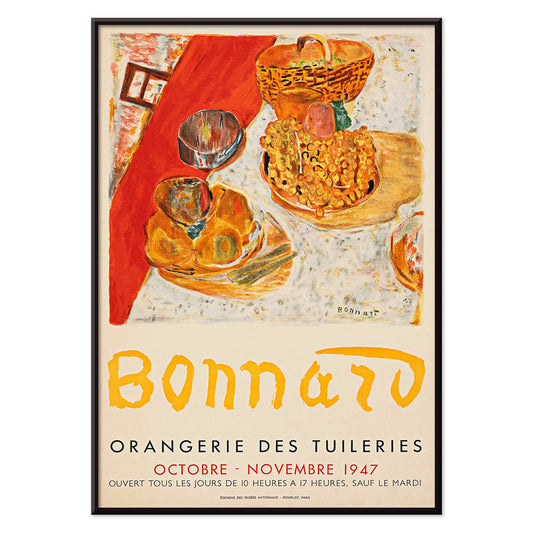
Exposition Bonnard Poster
okänd konstnär · 1947 · solbelyst stillebenposter som balanserar kraftfulla färgfält och elegant utställningstypografi i varm palett
Poster från 102 kr · Inramad från 181.33 kr
Ordinarie pris Från 68.00 krOrdinarie pris -
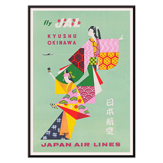
Kyushu-Okinawa Poster
okänd konstnär · 1962 · levande japanskt reseaffischmotiv med traditionella figurer och djärva öinspirerade grafiska former
Poster från 102 kr · Inramad från 181.33 kr
Ordinarie pris Från 68.00 krOrdinarie pris -
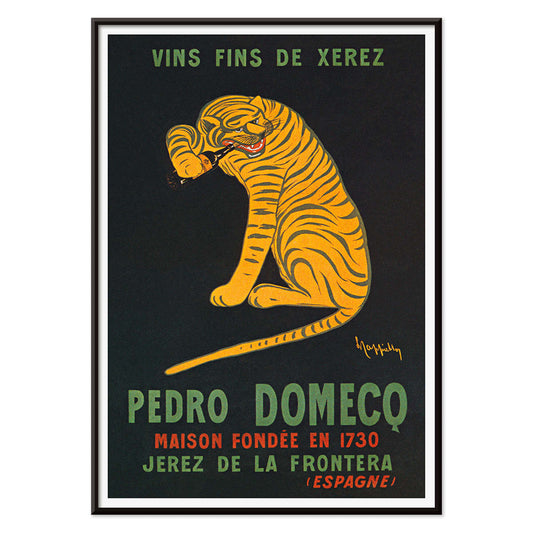
Xerez Pedro Domecq Poster
Leonetto Cappiello · 1930 · ikonisk tigerposter som hoppar fram ur djup svart bakgrund för Xerez sherry
Poster från 102 kr · Inramad från 181.33 kr
Ordinarie pris Från 68.00 krOrdinarie pris -
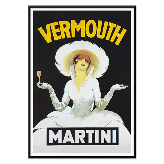
Vermouth Martini Poster
Marcello Dudovich · 1918 · Stilren vermouth annonsaffisch med en stilig kvinna i vitt och starka gula accenter
Poster från 102 kr · Inramad från 181.33 kr
Ordinarie pris Från 68.00 krOrdinarie pris -
Balsam Aperitif Poster
Jean d'Ylen · 1923 · Lekfull Art Deco-poster med chic kvinna intill ett jättestort cocktailglas
Poster från 102 kr · Inramad från 181.33 kr
Ordinarie pris Från 68.00 krOrdinarie pris -
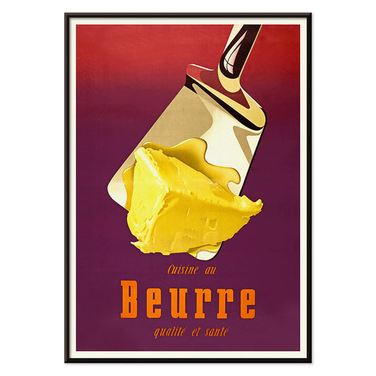
Smör Poster
Donald Brun · 1951 · Lekfull poster med smör i mjuk airbrushskuggning och tydlig midcentury schweizisk klarhet
Poster från 102 kr · Inramad från 181.33 kr
Ordinarie pris Från 68.00 krOrdinarie pris -
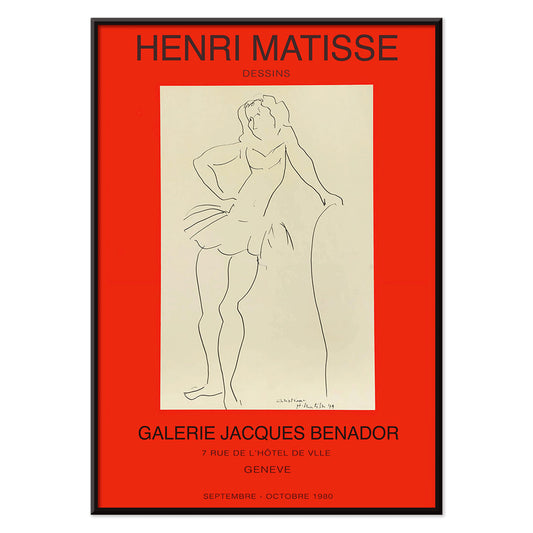
Exposition Matisse-poster
okänd konstnär · 1980 · minimalistisk utställningsposter med en dansande figur i svart linje och stark röd text
Poster från 102 kr · Inramad från 181.33 kr
Ordinarie pris Från 68.00 krOrdinarie pris -
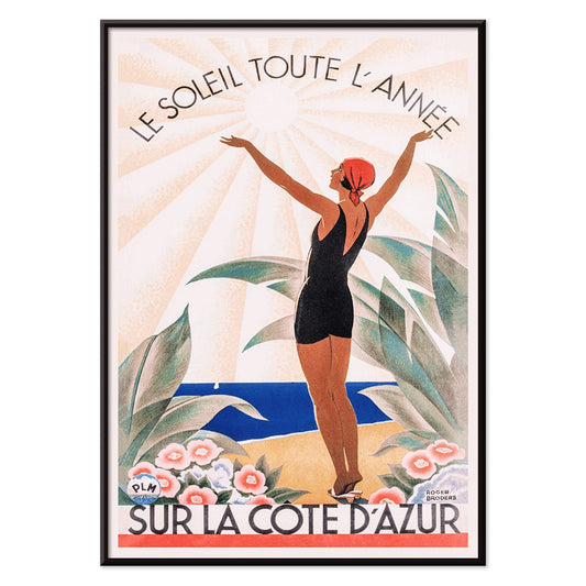
Sur la Côte d'Azur Poster
Roger Broders · 1950 · Solbelyst rivieraposter med stiliserade badgäster, segelbåtar och kraftfulla Art Decos former
Poster från 102 kr · Inramad från 181.33 kr
Ordinarie pris Från 68.00 krOrdinarie pris -
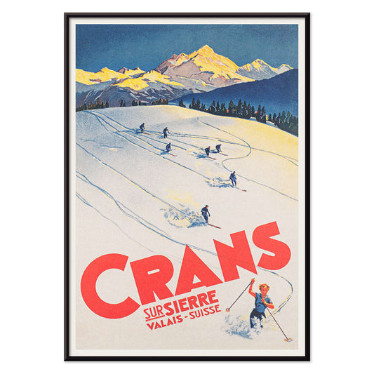
Crans-sur-Sierre Poster
okänd konstnär · 1955 · dynamisk alpinsk skidposter med kraftfulla färgfält, skarpa pister och blå himmel
Poster från 102 kr · Inramad från 181.33 kr
Ordinarie pris Från 68.00 krOrdinarie pris -
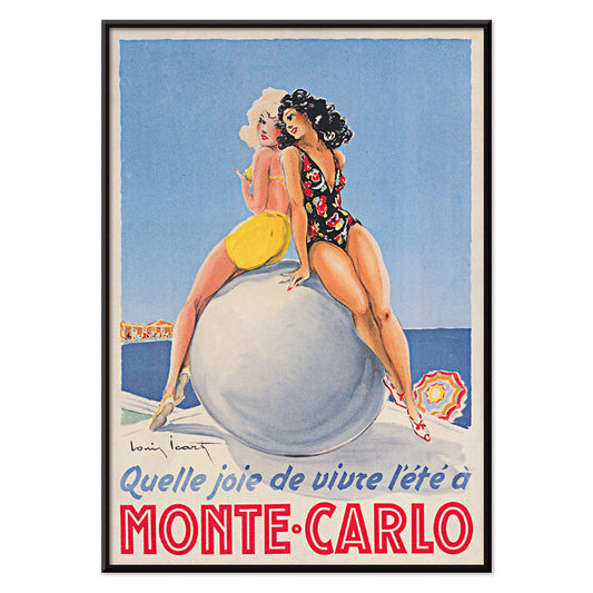
Monte Carlo Poster
Louis Icart · 1952 · Glamourös Monte Carlo-poster med självsäker badande kvinna och distinkt Art Deco-typografi
Poster från 102 kr · Inramad från 181.33 kr
Ordinarie pris Från 68.00 krOrdinarie pris -
Stilla havets vibrationer Poster
okänd konstnär · 1970 · färgstark surfposter med dynamiska figurer i blått och varma rosa och orange accenter
Poster från 102 kr · Inramad från 181.33 kr
Ordinarie pris Från 68.00 krOrdinarie pris -
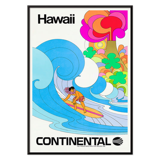
Continental Hawaii Airline Poster
Okänd konstnär · 1960 · glad surfposter från Hawaii med surfer i blomsterkrans och psykedelisk blombakgrund
Poster från 102 kr · Inramad från 181.33 kr
Ordinarie pris Från 68.00 krOrdinarie pris -
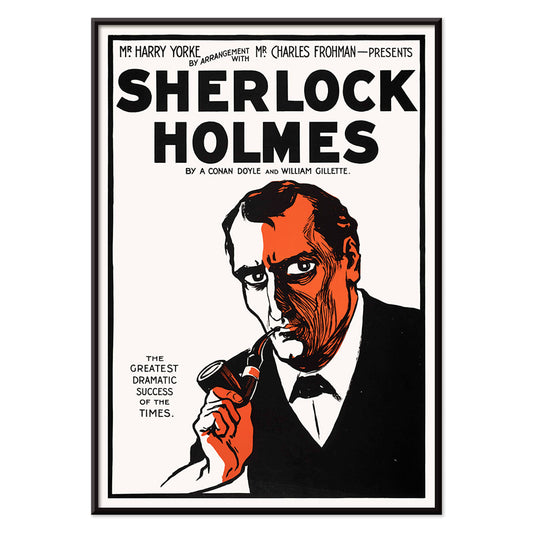
Sherlock Holmes Poster
okänd konstnär · 1901 · dramatisk Sherlock Holmes poster med pipa och deerstalker i skarp svart, vitt och orange
Poster från 102 kr · Inramad från 181.33 kr
Ordinarie pris Från 68.00 krOrdinarie pris -
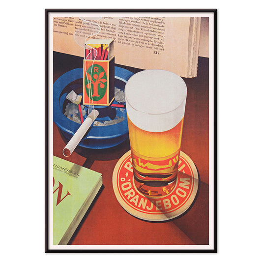
Öl och cigarett Poster
Okänd konstnär · 1935 · grafisk poster med öl och cigarett, skummande glas och kraftfulla röda och blå accenter
Poster från 102 kr · Inramad från 181.33 kr
Ordinarie pris Från 68.00 krOrdinarie pris -
Pepito Vasquez Poster
Tito Livio De Madrazo · 1954 · dynamisk danseffisch med förlängd bandlik figur mot djärv svart bakgrund
Poster från 102 kr · Inramad från 181.33 kr
Ordinarie pris Från 68.00 krOrdinarie pris -
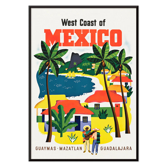
Mexikos västkust Poster
Ray Bethers · 1935 · solbelyst kustby poster med palmer, blått hav och tydlig resetypografi vintage
Poster från 102 kr · Inramad från 181.33 kr
Ordinarie pris Från 68.00 krOrdinarie pris -
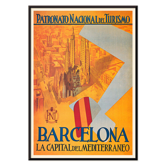
Medelhavets huvudstad Poster
okänd konstnär · 1992 · grafisk Barcelona-poster med stiliserad stadssilhuett och kraftfulla blå och röda accenter
Poster från 102 kr · Inramad från 181.33 kr
Ordinarie pris Från 68.00 krOrdinarie pris -
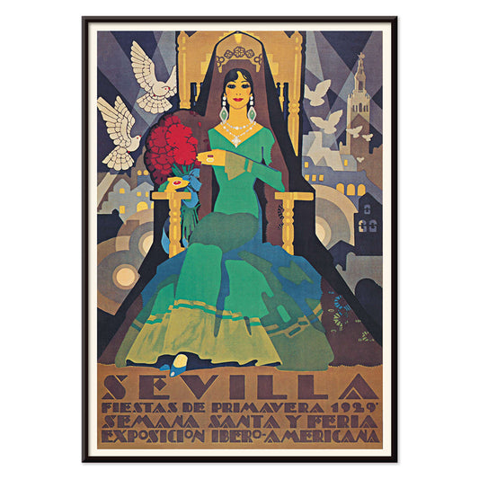
Sevilla Fiestas de Primavera Poster
okänd konstnär · 1929 · Art Deco-festivalaffisch från Sevilla med en grönklädd figur och två vita duvor
Poster från 102 kr · Inramad från 181.33 kr
Ordinarie pris Från 68.00 krOrdinarie pris -
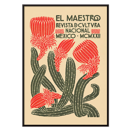
El Maestro 1 Poster
Okänd konstnär · 1921 · Mexikansk blommig poster med kraftiga röda blommor och stiliserad grön kaktus på beige
Poster från 102 kr · Inramad från 181.33 kr
Ordinarie pris Från 68.00 krOrdinarie pris -
Sevilla vårfestivaler 1932 Poster
Okänd konstnär · 1932 · Färgstark Sevillaposter med flamencodansare över en stiliserad stadssilhuett
Poster från 102 kr · Inramad från 181.33 kr
Ordinarie pris Från 68.00 krOrdinarie pris -
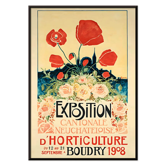
Exposition Cantonale Neuchateloise Poster
Edmond Boitel · 1908 · Livfull Belle Epoque-affisch med rikt blomsterarrangemang och tydlig utställningstypografi i vintagestil
Poster från 102 kr · Inramad från 181.33 kr
Ordinarie pris Från 68.00 krOrdinarie pris -
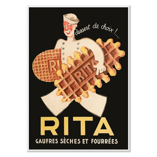
Rita Våfflor Poster
Leon Dupin · 1933 · Lekfull poster med våfflor, leende kock och varma gyllene toner
Poster från 102 kr · Inramad från 181.33 kr
Ordinarie pris Från 68.00 krOrdinarie pris -
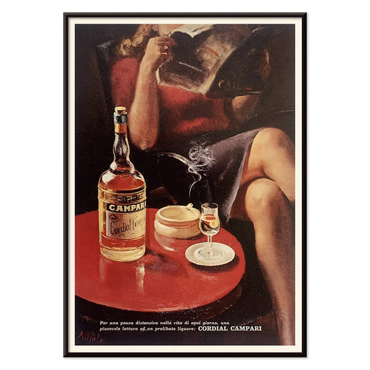
Cordial Campari Poster
okänd konstnär · 1926 · art deco-poster med en stilfull kvinna och djärva röda geometriska former
Poster från 102 kr · Inramad från 181.33 kr
Ordinarie pris Från 68.00 krOrdinarie pris -
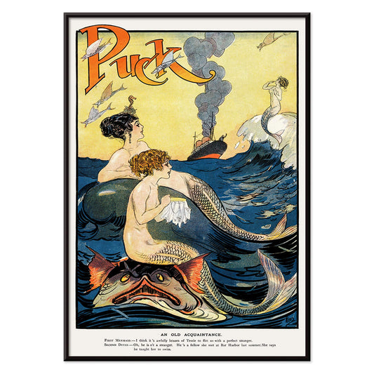
Sjöjungfrur syr Poster
okänd konstnär · 1911 · lekfull poster med sjöjungfrur, kraftiga konturer, maritim fantasi och livfull färgpalett
Poster från 102 kr · Inramad från 181.33 kr
Ordinarie pris Från 68.00 krOrdinarie pris -
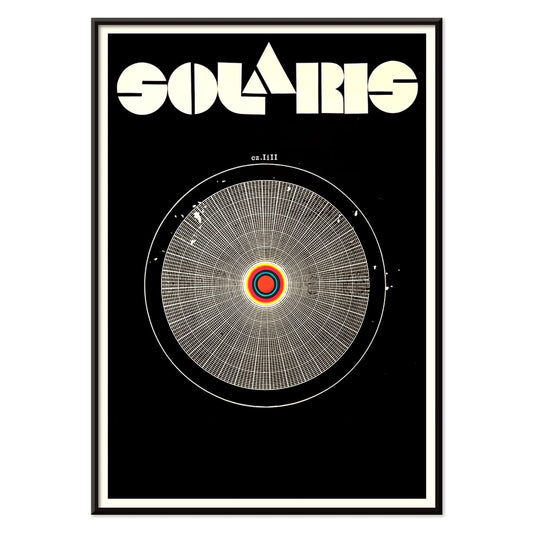
Solaris Poster
okänd konstnär · 1972 · hypnotisk rymdposter med orbiterande former och kraftfulla röda och blå kontraster
Poster från 102 kr · Inramad från 181.33 kr
Ordinarie pris Från 68.00 krOrdinarie pris -
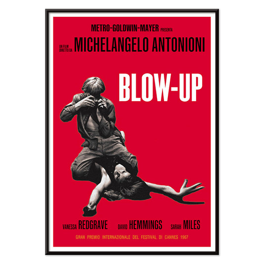
Blow Up Poster
okänd konstnär · 1966 · grafisk filmaffisch med kraftfullt rött fält och skarpt fotografiskt fokus
Poster från 102 kr · Inramad från 181.33 kr
Ordinarie pris Från 68.00 krOrdinarie pris -
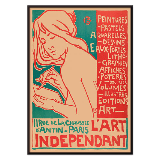
L'Art Independant Poster
Emile Berchmans · 1915 · Art Nouveau-poster med kvinnlig konstnär i svepande linjer och starka röda detaljer
Poster från 102 kr · Inramad från 181.33 kr
Ordinarie pris Från 68.00 krOrdinarie pris


72/520 items
- Förgör denna galna best Poster
- Shaw or Irony Poster
- Les Lalanne Poster
- Punch Boutique Poster
- Dansande par i snön Poster
- Jet Clipper till Hawaii Poster
- Campari Soda Poster
- Bec-Kina Poster
- Kohler Chocolat Poster
- Matisse Dansande Figurer Poster
- Tom Krojer utställningsposter Poster
- Berlin gatubild Poster
- Ernst Kirchner-utställning Poster
- Sittande kvinna bakifrån Poster
- Rött hår blå hatt Poster
- El Comienzo Poster
- Parler Seul 2 Poster
- Mahatmas nuvarande ståndpunkt Poster
- Skymningens ring Poster
- Parler Seul Poster
- Faun och Nymf Poster
- Dröm Poster
- Le Concert Poster
- Fågel som passerar ett moln Poster
- Kvinnoporträtt Poster
- Den rosa panterns hämnd Poster
- Kvinna och fågel om natten Poster
- Riley Blaze Poster
- Besök Puerto Rico Poster
- Almanaque Poster
- Ät mer frukt Poster
- The Jefferson Airplane Poster
- Snoopy Come Home Poster
- Till London med Jet Clipper Poster
- Kyushu-Okinawa Poster
- Xerez Pedro Domecq Poster
- Balsam Aperitif Poster
- Smör Poster
- Crans-sur-Sierre Poster
- Monte Carlo Poster
- Stilla havets vibrationer Poster
- Continental Hawaii Airline Poster
- Sherlock Holmes Poster
- Öl och cigarett Poster
- Mexikos västkust Poster
- El Maestro 1 Poster
- Rita Våfflor Poster
- Cordial Campari Poster
- Solaris Poster
- Blow Up Poster
- L'Art Independant Poster
Gatan som galleri
Reklamaffischer föddes som ett offentligt språk, klistrade på kiosker, spårvagnshållplatser och kafévggar där bilden hade sekunder på sig att göra sitt jobb. Från Belle Époque till efterkrigstidens modernism utvecklades postern till vardagens väggkonst, någonstans mellan nyheter och teater. Kromolitografi gav sammetslena färgtoner; senare årtionden skärpte budskapet med barsk sans-serif och silhuetter som var läsbara på avstånd. Dessa vintageblad var aldrig neutrala dekorationer: de dokumenterade vad en stad ville sälja, hylla eller varna för, i ett tempo styrt av folkmassor och gatlampor.
Jugendens förförelse och grafisk förenkling
I sekelskiftets skör var jugendstilen kommers som spektakel, omslutande vardagsprodukter i ornamentlinjer och stiliserade figurer. Job (1897) av Alphonse Mucha bygger sin profil av slingrande konturer och dämpade guldtoner, där rök gestaltas som mönster snarare än dis. Vermouth Martini (1920) av Leonetto Cappiello ställer citrongula flaskor mot ett nattsvart fält, en kontrastlektion som förutser modern branding. Tournée du Chat Noir (1896) av Théophile Alexandre Steinlen tillför Montmartres bett med platt rött, skarpa morrhår och en blick avvägd för gatan. För närliggande stilar och signaturer, vandra mellan Reklam, Alphonse Mucha och Leonetto Cappiello.
Att placera vintage väggkonst i samtida rum
Eftersom dessa affischer är designade för snabb läsning fungerar de väl som designobjekt hemma. Börja med skalan: en stor poster över en skänk läses som ett arkitektoniskt element, medan två medelstora tryck staplade kan stabilisera en smal vägg. Hämta färgtoner från rummet snarare än att matcha allt; ett enda eko av karmin, oliv eller mässing räcker för att göra trycket avsiktligt. I en studio eller hall håller den disciplinerade geometrin i Bauhaus rytmen rask; i ett vardagsrum med rundade möbler och sammet sitter jugendlinjen naturligt bredvid mjukare texturer. Har rummet redan starkt mönster, överväg lugnare kompanjoner från Svartvitt för att ge ögat vila.
Cinematisk modernism och japanskt grafiskt slag
Midcentury-design bytte utsmyckning mot kraft, och filmaffischer blev laboratorium för visuell ekonomi. Vertigo (1958) av Saul Bass är nästan ett diagram över ångest: spiral, figur och snedställd titel arrangerade för att neka stillhet. I närheten, i japansk modernism, behandlar Kabuki (1974) av Ikko Tanaka svart kalligrafi som en trumrytm och låter papperet bli aktivt rum snarare än bakgrund. Dessa tryck matchar lack, valnöt, borstat aluminium och rena hyllplan. Vill du föra samma grafiska kadens genom epoker, länka Movie med det lugnare uttrycket i Minimalistiskt och de snabbt lästa rörelsetonerna i Bike.
Kuratera en vägg som känns levd
För att bygga en sammanhållen gallerivägg, upprepa en begränsning och variera allt annat: håll marginaler konsekventa eller håll en snäv palett och låt typografi och illustration skifta från verk till verk. Att blanda vertikala och horisontella format kan skapa en mer redaktionell rytm; Vertikala Posters blir starka ankare medan ett enstaka landskap kan fungera som pauslinje. Ramval betyder mindre än proportion: en smal svart eller valnötsram håller typografin skarp, medan en generös passepartout förvandlar en kommersiell bild till ett eftertänksamt konsttryck. Vill du ha en bred översikt men behålla temat, ger Alla Posters kontexten för att bygga din egen tidslinje av vintagedekoration.