


- Revenge of the Pink Panther Poster
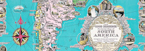
- Almanaque Poster
- Bauhaus 20 Poster
- Blue Japanese Crane Poster
- Snoopy come home Poster
- To London by Jet Clipper Poster
- Black Cat 4 Poster
- Black Cat 3 Poster
- Rita Gaufres Poster
- Black Cat 2 Poster
- Swing into books Poster
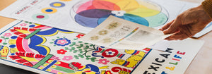
- Mexican Art & Life 1 Poster
- Prunus avium Poster
- British Overseas Airways Poster
- The New Yorker 2 Poster
- Petit Mentor Poster
- Japanese Art Poster
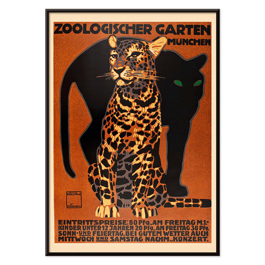
- Zoologischer Garten Poster
- The Endless Summer Poster
- Mickey Mouse Poster
- Grands Prix de France Poster
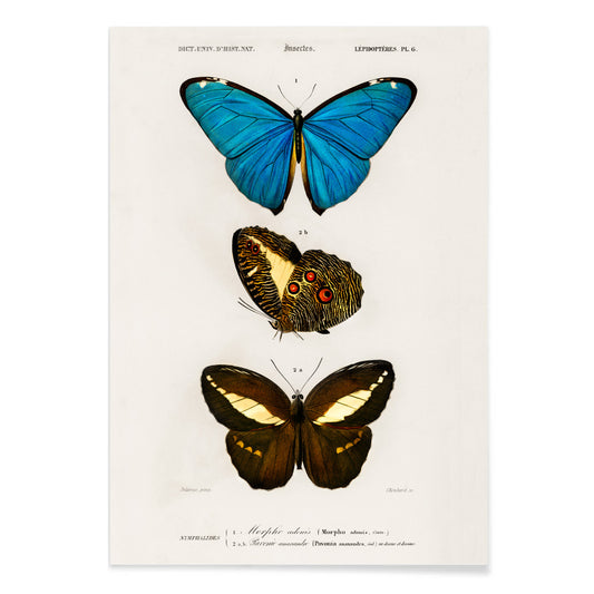
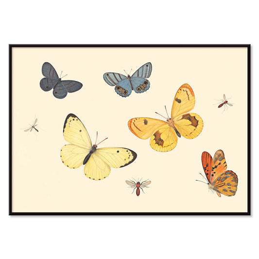
- Exotic butterflies Pl.097 Poster
- A Jungle Picnic 7 Poster
- A Jungle Picnic 4 Poster
- A Jungle Picnic 3 Poster
- A Jungle Picnic 20 Poster
- A Jungle Picnic 15 Poster
- A Jungle Picnic 1 Poster
- Alice in Wonderland Poster
- Lutte Poster
- Faust , tragédie de Goethe Poster
- Babar en Voiture Poster
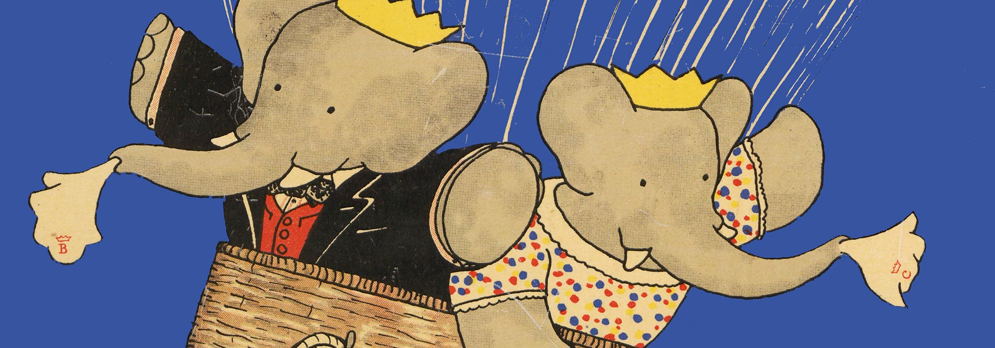
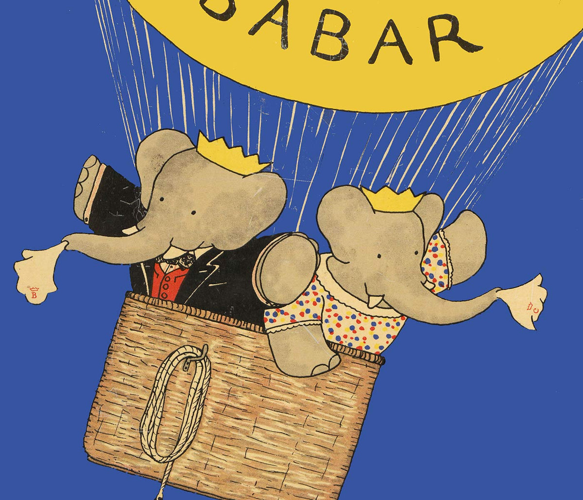
- Histoire de Babar Poster
- Le Voyage de Babar Poster
- Babar en famille Poster
- Mickey Reads Poster
- Nothing like a good book Poster
-
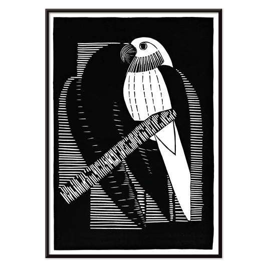
Parakeets Poster
Samuel Jessurun de Mesquita · 1927 · Striking parakeets poster in crisp black and white with geometric Art Deco rhythm
Poster from 102 kr · Framed from 181.33 kr
Regular price From 68.00 krRegular price -
Wake up and read Poster
Unknown artist · 1961 · Modernist reading campaign poster with bold typography and crisp red and blue contrast
Poster from 102 kr · Framed from 181.33 kr
Regular price From 68.00 krRegular price -
Zoologischer Garten Poster
Ludwig Hohlwein · 1912 · Striking Munich zoo poster featuring a bold striped big cat and crisp lettering
Poster from 102 kr · Framed from 181.33 kr
Regular price From 68.00 krRegular price -
Blue & Brown Butterflies Poster
Charles Dessalines D' Orbigny · 1806 · Delicate butterfly print pairing blue wings and earthy browns in a scientific plate
Poster from 102 kr · Framed from 181.33 kr
Regular price From 68.00 krRegular price -
Linum glandulosum Poster
Charles Dessalines D Orbigny · 1847 · Delicate yellow flax botanical print with precise linework on softly aged paper
Poster from 102 kr · Framed from 181.33 kr
Regular price From 68.00 krRegular price -
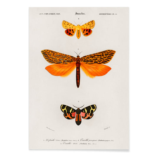
Orange moths Poster
Charles Dessalines D Orbigny · 1841 · Lively orange moth scientific print arranged as a precise natural history plate
Poster from 102 kr · Framed from 181.33 kr
Regular price From 68.00 krRegular price -
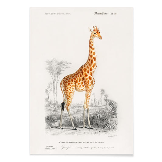
Giraffa camelopardalis Poster
Charles Dessalines D Orbigny · 1841 · Elegant giraffe print with fine linework and soft natural history calm
Poster from 102 kr · Framed from 181.33 kr
Regular price From 68.00 krRegular price -
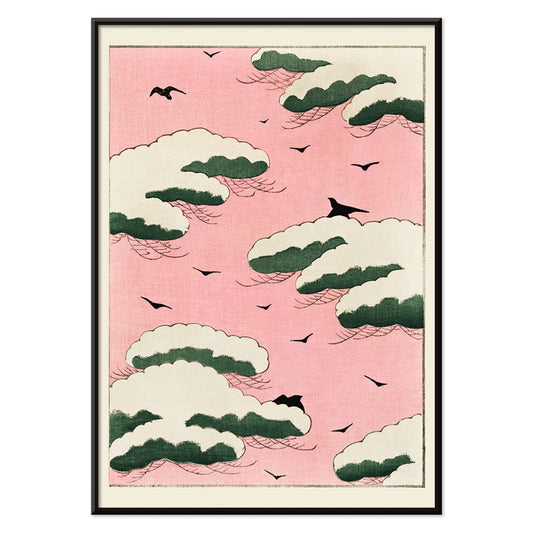
Pink sky Poster
Watanabe Seitei · 1895 · Airy sky-and-birds poster with soft pink haze and floating green cloud forms
Poster from 102 kr · Framed from 181.33 kr
Regular price From 68.00 krRegular price -
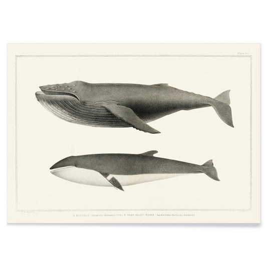
Humpback whale and Minke whale Poster
Charles Melville Scammon · 1872 · Scholarly whale vintage print showing humpback and minke profiles with understated grey tones
Poster from 102 kr · Framed from 181.33 kr
Regular price From 68.00 krRegular price -
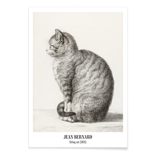
Sitting cat, facing left Poster
Jean Bernard · 1815 · Quiet feline art print in soft graphite tones, seated in left profile
Poster from 102 kr · Framed from 181.33 kr
Regular price From 68.00 krRegular price -
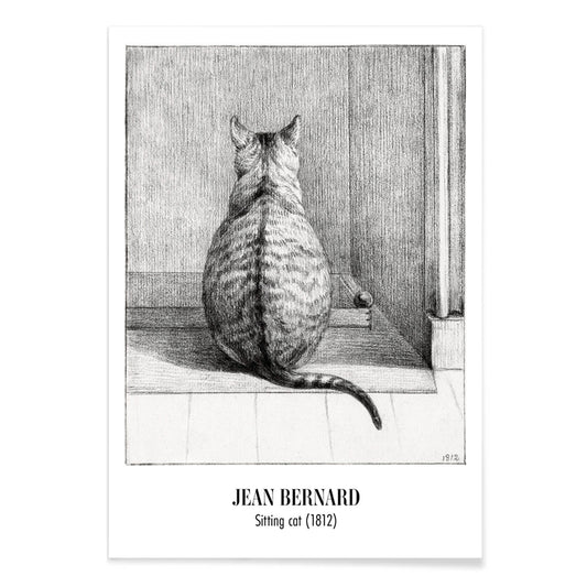
Sitting cat, from behind Poster
Jean Bernard · 1812 · Quiet cat vintage print rendered in soft greys, seen from behind
Poster from 102 kr · Framed from 181.33 kr
Regular price From 68.00 krRegular price -
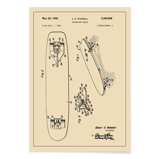
Skate Board Brake Patent Poster
Albert O. Waddell · 1969 · Precise skateboard brake patent print with crisp diagrams on warm aged paper
Poster from 102 kr · Framed from 181.33 kr
Regular price From 68.00 krRegular price -
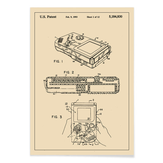
Gameboy Patent Poster
Aled Lewis · 1989 · Diagrammatic Game Boy poster with patent-style views and crisp black linework on beige
Poster from 102 kr · Framed from 181.33 kr
Regular price From 68.00 krRegular price -
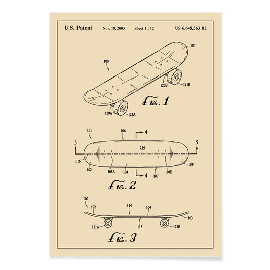
Skateboard patent Poster
US Patents · 1965 · Clean skateboard patent vintage print with multi-view diagrams and precise annotations
Poster from 102 kr · Framed from 181.33 kr
Regular price From 68.00 krRegular price -
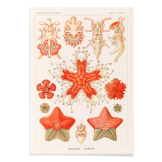
Asteridea Poster
Adolf Glitsch · 1904 · Radiant starfish scientific print displaying varied textures in a balanced specimen layout
Poster from 102 kr · Framed from 181.33 kr
Regular price From 68.00 krRegular price -
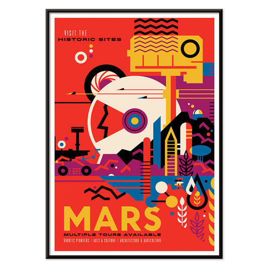
Mars Poster
K8 Spencer · 1976 · Retro Mars tourism poster mapping NASA landing sites across a bold red planetscape
Poster from 102 kr · Framed from 181.33 kr
Regular price From 68.00 krRegular price -
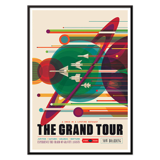
The Grand Tour Poster
Karlyn Murphy · 1977 · Vibrant retro solar system poster with sweeping trajectories and bold planetary graphics
Poster from 102 kr · Framed from 181.33 kr
Regular price From 68.00 krRegular price -
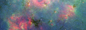
Galactic Graveyard Poster
Charles Carter · 2023 · Haunting deep space poster with ember red nebulae and scattered stellar debris
Poster from 102 kr · Framed from 181.33 kr
Regular price From 68.00 krRegular price -
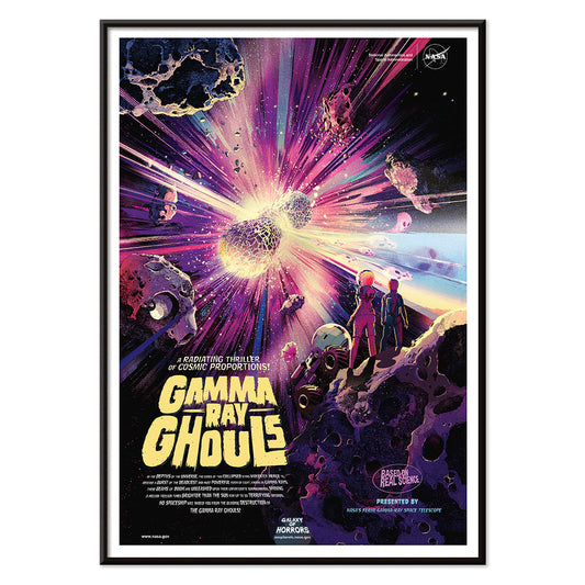
Gamma Ray Ghouls Poster
Don Davis · 2019 · Retro sci-fi space poster with astronauts drifting through a neon cosmic blast
Poster from 102 kr · Framed from 181.33 kr
Regular price From 68.00 krRegular price -
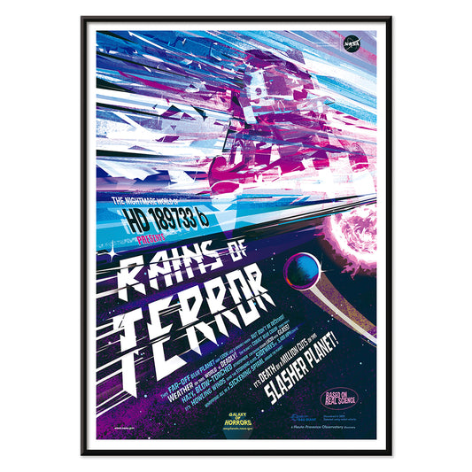
Rains of Terror Poster
Eleni Katsenidou · 1995 · Vibrant sci-fi storm poster with a looming planet and slanting meteorlike rain
Poster from 102 kr · Framed from 181.33 kr
Regular price From 68.00 krRegular price -
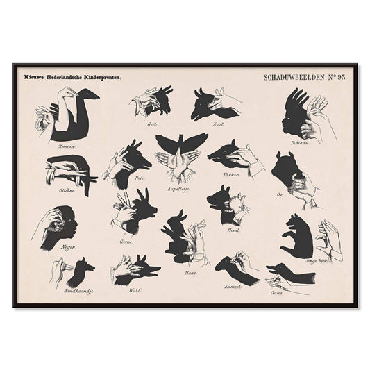
Shadow Hands Poster
George Lodewijk Funke · 1879 · Playful hand-shadow vintage print presenting puppet shapes in crisp black silhouettes
Poster from 102 kr · Framed from 181.33 kr
Regular price From 68.00 krRegular price -
Five Butterflies Poster
Pieter Withoos · 1675 · Delicate insect print featuring five butterflies, a wasp, and two flies on pale ground
Poster from 102 kr · Framed from 181.33 kr
Regular price From 68.00 krRegular price -
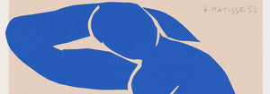
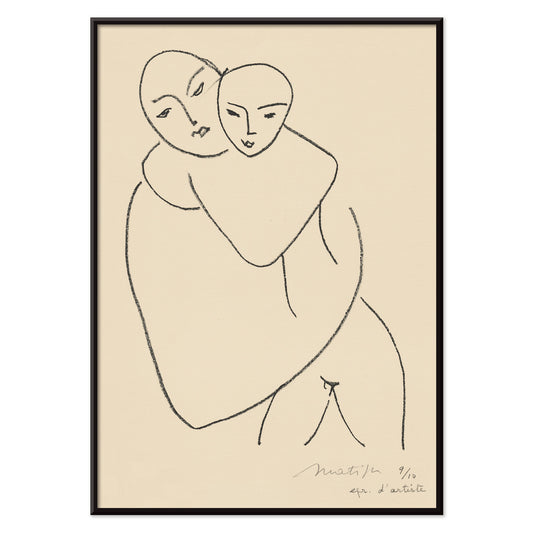
Vierge et enfant Poster
Henri Matisse · 1950 · Minimalist art print of a mother and child in spare black line
Poster from 102 kr · Framed from 181.33 kr
Regular price From 68.00 krRegular price -
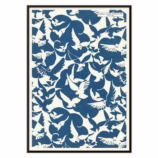
Lesbesse crépe Poster
Charles Goy · 1928 · Minimalist bird poster with blue silhouettes on a cream advertising field
Poster from 102 kr · Framed from 181.33 kr
Regular price From 68.00 krRegular price -
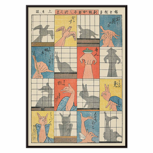
Eight shadow figures Poster
Utagawa Hiroshige · 1842 · Playful ukiyo-e poster of hand shadows and paper screens
Poster from 102 kr · Framed from 181.33 kr
Regular price From 68.00 krRegular price -
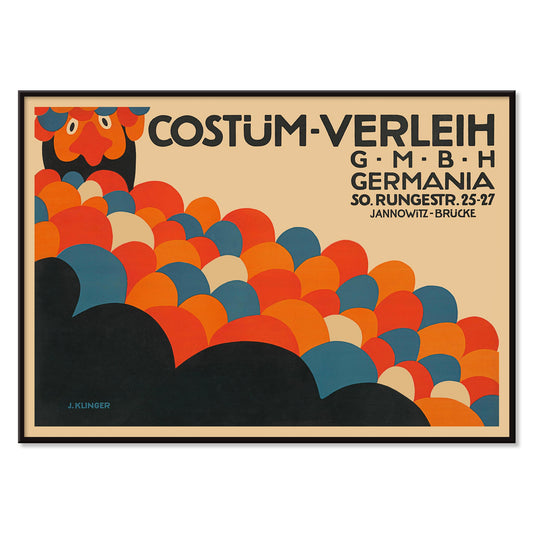
Costüm-Verleih Germania Poster
Julius Klinger · 1909 · Costume rental poster with bold abstract circles and Berlin lettering
Poster from 102 kr · Framed from 181.33 kr
Regular price From 68.00 krRegular price -
Don't gum up a book Poster
Arlington Gregg · 1936 · Bold library poster with a black figure over an open book
Poster from 102 kr · Framed from 181.33 kr
Regular price From 68.00 krRegular price -
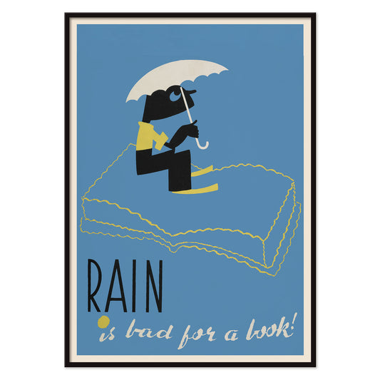
Rain Is Bad for a Book! Poster
Arlington Gregg · 1936 · A playful poster turns book protection into witty WPA graphic design
Poster from 102 kr · Framed from 181.33 kr
Regular price From 68.00 krRegular price -
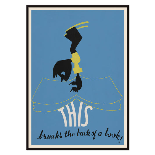
This breaks the back of a book! Poster
Arlington Gregg · 1936 · Witty advertising poster showing a bent figure above an open book
Poster from 102 kr · Framed from 181.33 kr
Regular price From 68.00 krRegular price -
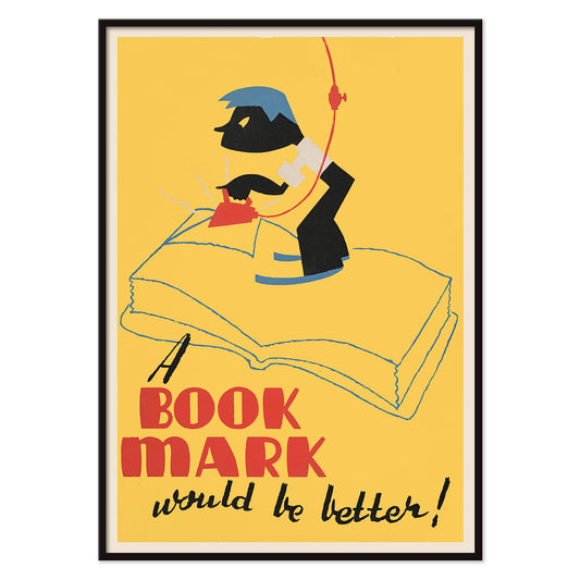
A book mark would be better! Poster
Arlington Gregg · 1936 · Witty poster showing a boy ironing an open book beneath bold lettering
Poster from 102 kr · Framed from 181.33 kr
Regular price From 68.00 krRegular price


30/102 items
- Parakeets Poster
- Wake up and read Poster
- Zoologischer Garten Poster
- Giraffa camelopardalis Poster
- Pink sky Poster
- Humpback whale and Minke whale Poster
- Sitting cat, facing left Poster
- Sitting cat, from behind Poster
- Skate Board Brake Patent Poster
- Gameboy Patent Poster
- Skateboard patent Poster
- Asteridea Poster
- Mars Poster
- The Grand Tour Poster
Where play meets the archive
Kids wall art works best when it carries real stories, not sugary slogans. This collection gathers vintage poster imagery from picture books, scientific charts, travel ephemera, and early modern illustration, chosen for clear lines and legible color. Many originals were made for classrooms, libraries, and family encyclopedias, so the images stay readable from across a room. Think of it as a small gallery wall of curiosities: animals that look observed, maps that invite daydreaming, and diagrams that make learning feel tactile.
Animals, ink, and the pleasure of looking
Abbott Handerson Thayer’s Tigers Head (1911) has a painterly hush: fur built from soft strokes, eyes alert without menace. Utagawa Kuniyoshi turns mischief into pattern in Cats (1847–1850), where ukiyo-e flatness makes every tail a graphic curve. For narrative warmth, Jean de Brunhoff’s Histoire de Babar keeps the line clean and the color decisive, close to a child’s confident drawing. These sit naturally beside Animals, Oriental, and Classic Art for a wider sense of how illustration travels across cultures.
Charts that teach without preaching
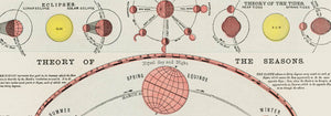
Educational prints have their own visual logic: information arranged as rhythm, repetition, and color. Marcius Willson’s Chromatic scale of colors (1890) turns theory into wedges and gradients, a diagram that also reads as abstract design. Try placing it near books or building toys so the colors become reference points in daily play. The same appeal runs through natural-history plates and classroom graphics that overlap with Science and Botanical, where naming and sorting become part of the decoration.
Room-by-room styling for growing minds
For nurseries, keep the palette quiet: animal studies and charts work well with warm whites, pale wood, and linen textiles, letting the poster act as a gentle focal point. In a playroom, a bolder print can stabilize visual clutter, especially near shelving and storage. Hang key pieces a little lower than in adult rooms so children can read images at their own height. If the space already leans primary, choose one hue to lead; if it is neutral, introduce a single saturated accent through a map or diagram. For a study corner, Maps integrates naturally above a desk or reading nook.
Pairing, framing, and a small leap to space
When curating a kids gallery wall, build an easy rhythm: one narrative image, one diagram, and one quieter animal or landscape. White mats help busy illustrations breathe, while simple oak frames make vintage paper tones feel friendly. Leave a little empty space so the wall can expand as interests change. For older kids, NASA-era graphic clarity adds calm structure: The Grand Tour balances dusty blues with tidy typography and teaches scale through arrangement. It pairs well with Space and, for a simpler counterpoint, Minimalist prints that keep attention on the image rather than the room.