


-
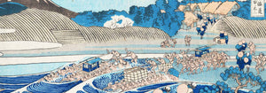
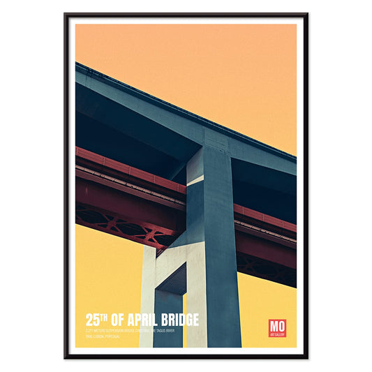
25th of April Bridge Poster
Mo Art Gallery · 2023 · Geometric Lisbon bridge poster balancing bold arcs, cables, and sunlit color blocks
Poster from 100.50 kr · Framed from 178.67 kr
Regular price From 67.00 krRegular price -
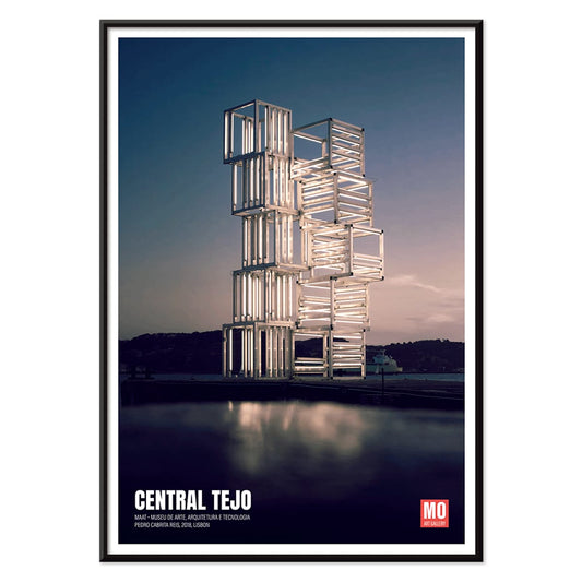
Central Tejo Poster
Mo Art Gallery · 2022 · Minimalist architectural poster with cool blue lines evoking Lisbon riverside power station
Poster from 100.50 kr · Framed from 178.67 kr
Regular price From 67.00 krRegular price -
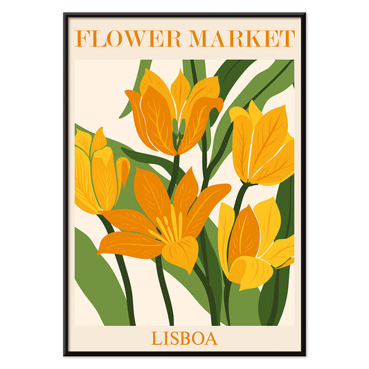
Flower Market Lisbon Poster
MORYARTY · 2019 · Sunlit Lisbon flower market poster with bold blooms and lush green leaves
Poster from 100.50 kr · Framed from 178.67 kr
Regular price From 67.00 krRegular price -
Lisbon Bridge Poster
MORYARTY · 2017 · Minimal black-and-white bridge poster with a lone sailboat and calm river space
Poster from 100.50 kr · Framed from 178.67 kr
Regular price From 67.00 krRegular price -
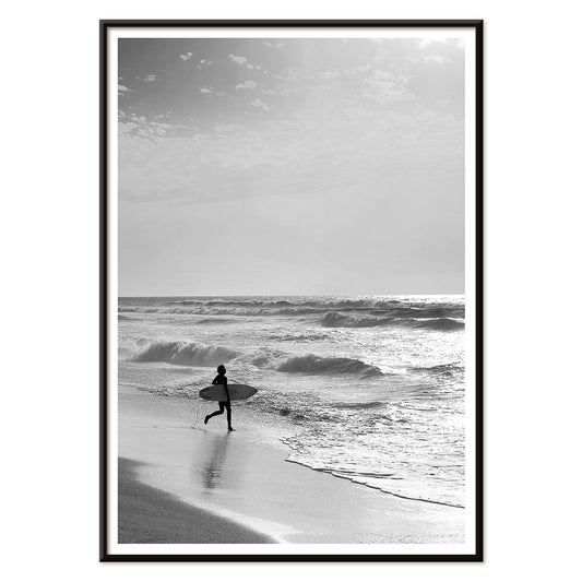
Surfer in Portugal Poster
MORYARTY · 2022 · Minimal black-and-white surfer poster capturing calm shoreline energy and open Atlantic horizons
Poster from 100.50 kr · Framed from 178.67 kr
Regular price From 67.00 krRegular price -
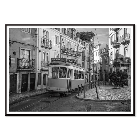
Lisbon Tramway 28 Poster
MORYARTY · Modern · Monochrome Lisbon Tram 28 poster with crisp city lines and nostalgic travel mood
Poster from 100.50 kr · Framed from 178.67 kr
Regular price From 67.00 krRegular price -
Alfama Poster
MORYARTY · 1940 · Monochrome Alfama skyline poster capturing Lisbon rooftops in crisp graphic silhouette
Poster from 100.50 kr · Framed from 178.67 kr
Regular price From 67.00 krRegular price -
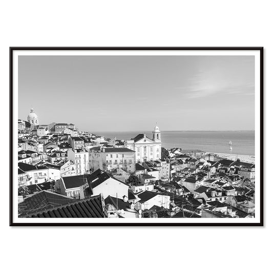
Lisbon Old City 1 Poster
MORYARTY · 2017 · Black-and-white Lisbon cityscape poster with layered rooftops and a calm waterfront horizon
Poster from 100.50 kr · Framed from 178.67 kr
Regular price From 67.00 krRegular price -
Lisbon Old City 2 Poster
MORYARTY · 1950 · Monochrome Lisbon rooftops poster with stacked facades and quiet Old Town atmosphere
Poster from 100.50 kr · Framed from 178.67 kr
Regular price From 67.00 krRegular price -
Lisbon Azulejo 1 Poster
MORYARTY · Contemporary · Blue azulejo ship poster with ornate tile border and crisp nautical linework
Poster from 100.50 kr · Framed from 178.67 kr
Regular price From 67.00 krRegular price -
Lisbon Azulejo 2 Poster
MORYARTY · 1755 · Blue-and-white azulejo pattern poster with ornate tile motifs and crisp symmetry
Poster from 100.50 kr · Framed from 178.67 kr
Regular price From 67.00 krRegular price -
Minimalist Lisbon Map Poster
MORYARTY · 2018 · Minimalist Lisbon map poster in blue and white with a calm architectural skyline
Poster from 100.50 kr · Framed from 178.67 kr
Regular price From 67.00 krRegular price


Lisbon, held in light and stone
Lisbon has a way of turning daily routes into compositions: stair-stepped streets, long shadows on stucco, and tiled surfaces that catch the sun like small mirrors. The city reads as both maritime and architectural, a place where the river horizon interrupts dense neighborhoods. In poster form, that mix becomes a language of diagonals, grids, and bright pauses. This collection follows that visual logic rather than postcard shorthand, keeping the focus on line, texture, and atmosphere. For a wider city-to-city contrast, the travel sensibility can sit neatly beside Barcelona, where light behaves differently but structure still leads.
Azulejo and infrastructure as graphic design
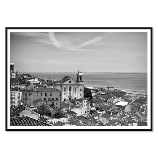
Two Lisbon motifs dominate the city’s image-making: ornament and engineering. Azulejo tilework is decorative, but it is also modular, built from repeats, borders, and slight irregularities that reward close viewing. Bridges and trams, by contrast, supply strict geometry and mechanical rhythm. The tension between those systems is why Lisbon imagery often feels designed rather than merely recorded. In 25th of April Bridge, Lisbon by Mo Art Gallery, the suspension lines measure the sky like ruled paper, while the red span anchors the river air with weight. At street level, Lisbon Tramway 28, Black & White Picture uses a tighter perspective, letting contrast and compression describe motion more than any literal blur.
Interior placement: calm structure, selective color
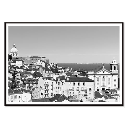
Lisbon prints work especially well when you treat them as structure first, color second. In an entryway or corridor, black and white photography emphasizes thresholds and direction, helping a narrow space feel intentional. Alfama, Lisbon Old City Landscape, Black & White Picture sits comfortably with oak, cane, linen, and limestone tones, because its tonal range echoes those materials rather than competing with them. Kitchens and dining corners can take more pattern, where tile motifs naturally relate to ceramics and glassware; that connection pairs easily with the mood of Kitchen. For companion pieces, Black & White keeps the palette restrained, while Blue lets azulejo hues become a deliberate accent.
Curating a gallery wall with tempo and scale
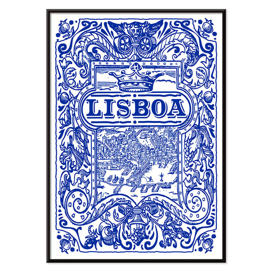
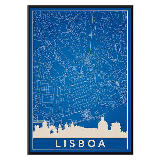
A convincing gallery wall depends on tempo: one image should set the pace, another should slow it down. A graphic anchor like Minimalist Lisbon Map brings clarity and spacing, while Lisbon Azulejo, Blue painted tile 2 adds surface complexity without turning the wall into visual noise. To open the arrangement, introduce horizon and air through Sea & Ocean, or reinforce place-making with Maps. Framing should follow the same logic: thin black frames emphasize rhythm and edges; pale wood softens the grid and connects to warm interiors.
Everyday Lisbon, seen as composition
The most convincing Lisbon wall art tends to avoid spectacle and instead notices how the city organizes small things: repeating windows, cobblestone textures, and the way stalls and awnings create blocks of color. Flower Market Lisbon by Moryarty is a good example, arranging hue like architecture, with structure underneath the liveliness. When you want more of that observational mood, Photo extends the same attention to light and surface, keeping the collection grounded in real streets rather than fantasy.