


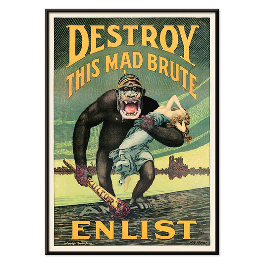
- Destroy this mad brute Poster
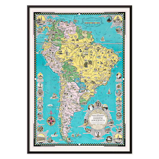
- The good neighbor of South America Poster
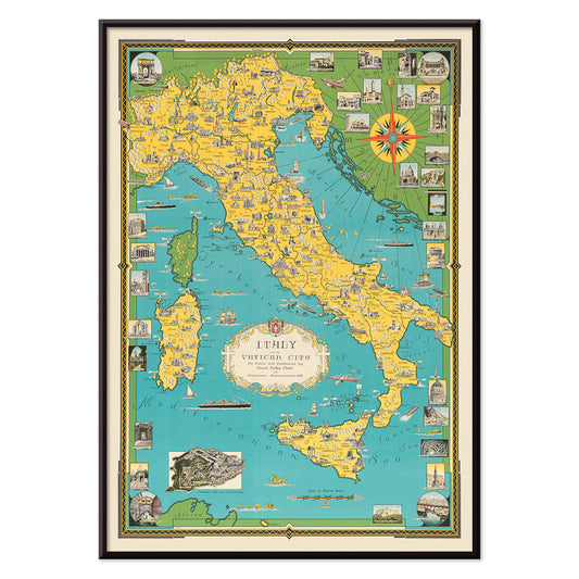
- Italy with Vatican City Poster
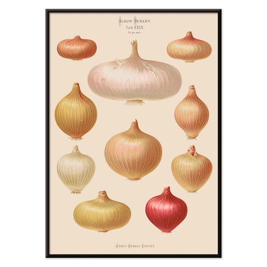
- Onions Poster
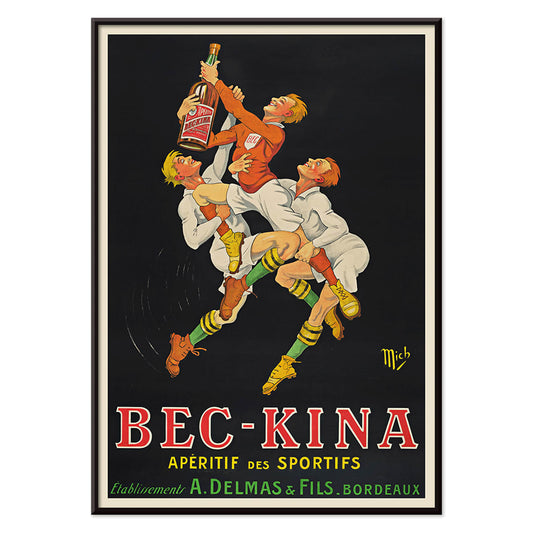
- Bec-Kina Poster
- Kohler Chocolat Poster
- Strawberry Thief Poster
- Tom Krojer Exhibition Poster Poster
- Ernst Kirchner Exhibition Poster
- El Comienzo Poster
- Parler Seul 2 Poster
- Twilight’s Ring Poster
- Parler Seul Poster
- Faun and Nymphe Poster
- The Dream Poster
- Le Concert Poster
- Bird passing through a Cloud Poster
- Female Artist Poster
- Revenge of the Pink Panther Poster
- Woman and Bird at Night Poster
- Bauhaus 20 Poster
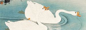
- Blue Japanese Crane Poster
- Snoopy come home Poster
- To London by Jet Clipper Poster
- Kyushu-Okinawa Poster
- Xerez Pedro Domeco Poster
- Balsam Aperitif Poster
- Butter Poster
- Crans Poster
- Monte Carlo Poster
- Beer and Cigarette Poster
- West Coast of Mexico Poster
- Rita Gaufres Poster
- Hibiscus Poster
-
Destroy this mad brute Poster
Harry Ryle Hopps · 1917 · Dramatic wartime poster featuring a helmeted gorilla advancing with club and captive
Poster from 102 kr · Framed from 181.33 kr
Regular price From 68.00 krRegular price -
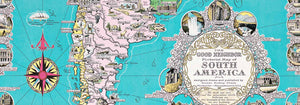
The good neighbor of South America Poster
Ernest Dudley Chase · 1935 · Bright illustrated South America map poster with animals, landmarks, and sea routes
Poster from 102 kr · Framed from 181.33 kr
Regular price From 68.00 krRegular price -
Italy with Vatican City Poster
Ernest Dudley Chase · 1935 · Illustrated Italy map poster featuring landmark vignettes and crisp lettering in vibrant colors
Poster from 102 kr · Framed from 181.33 kr
Regular price From 68.00 krRegular price -
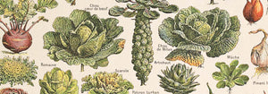
Onions Poster
Ernst Benary · 1876 · Detailed onion botanical print with bulbs, roots, and green shoots on beige
Poster from 102 kr · Framed from 181.33 kr
Regular price From 68.00 krRegular price -
Bec-Kina Poster
Michel Liebeaux · 1900 · Energetic rugby themed aperitif poster with bold figures reaching for a bottle
Poster from 102 kr · Framed from 181.33 kr
Regular price From 68.00 krRegular price -
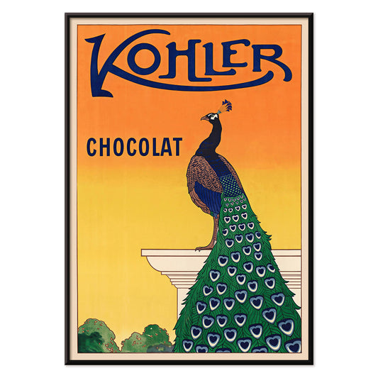
Kohler Chocolat Poster
F. Champenois · 1914 · Elegant Art Nouveau peacock poster advertising Kohler chocolate on a radiant orange background
Poster from 102 kr · Framed from 181.33 kr
Regular price From 68.00 krRegular price -
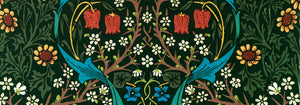
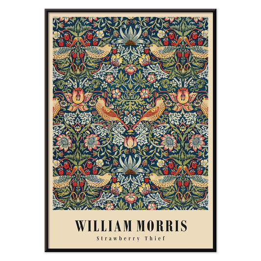
Strawberry Thief Poster
William Morris · 1883 · Iconic Arts and Crafts poster with thrushes, strawberries, and scrolling foliage in rich blues
Poster from 102 kr · Framed from 181.33 kr
Regular price From 68.00 krRegular price -
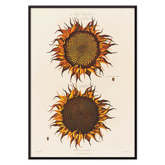
Ripe Sunflower Poster
Robert John Thornton · 1799 · Dramatic ripe sunflower botanical print with curling petals and lush green leaves
Poster from 102 kr · Framed from 181.33 kr
Regular price From 68.00 krRegular price -
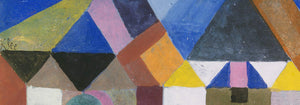
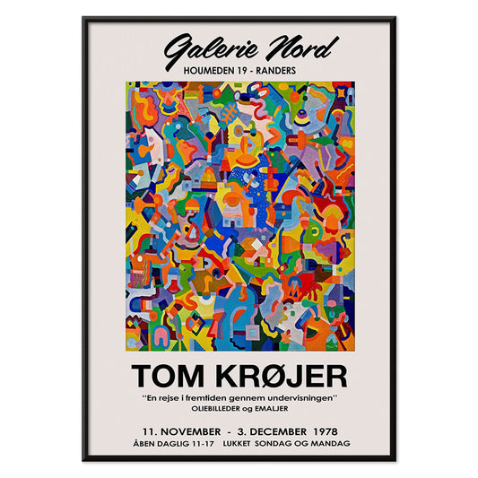
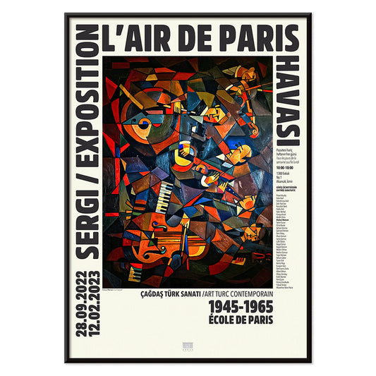
Tom Krojer Exhibition Poster Poster
Tom Krojer · 1989 · Dynamic geometric exhibition poster balancing vivid color blocks with crisp modern typography
Poster from 102 kr · Framed from 181.33 kr
Regular price From 68.00 krRegular price -
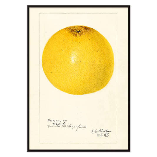
Citrus paradisi Poster
Amanda Almira Newton · 1919 · Luminous grapefruit botanical print balancing scientific clarity with soft watercolor shading
Poster from 102 kr · Framed from 181.33 kr
Regular price From 68.00 krRegular price -
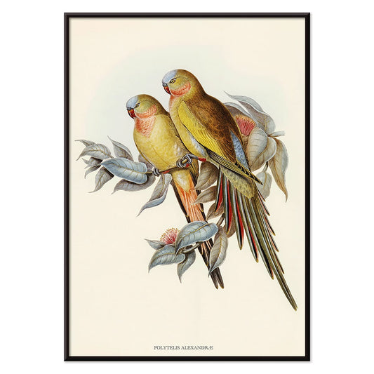
Polytelis Alexandrae Poster
Unknown artist · 1873 · Elegant parakeet print featuring two long-tailed birds in fresh green and rose hues
Poster from 102 kr · Framed from 181.33 kr
Regular price From 68.00 krRegular price -
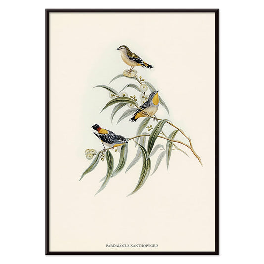
Pardalotus Xanthopygius Poster
Unknown artist · 1838 · Delicate pardalote print with three birds perched on eucalyptus branches in soft natural tones
Poster from 102 kr · Framed from 181.33 kr
Regular price From 68.00 krRegular price -
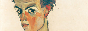
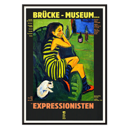
Ernst Kirchner Exhibition Poster
Ernst Kirchner · 1910 · Expressionist nude exhibition poster with bold black outlines and vivid blue and red
Poster from 102 kr · Framed from 181.33 kr
Regular price From 68.00 krRegular price -
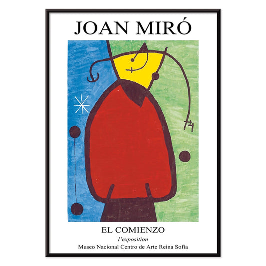
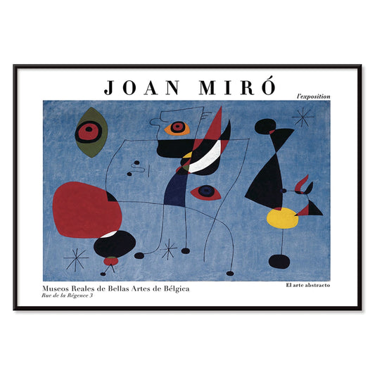
El Comienzo Poster
Joan Miro · 1972 · Playful abstract poster with biomorphic shapes and bold lines in vivid primary colors
Poster from 102 kr · Framed from 181.33 kr
Regular price From 68.00 krRegular price -
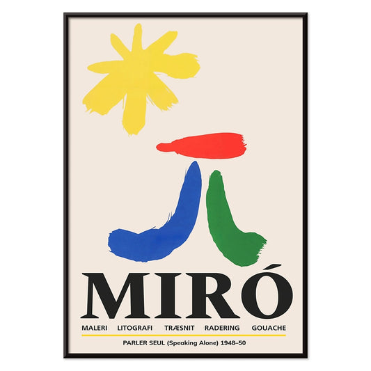
Parler Seul 2 Poster
Joan Miro · 1948 · Playful biomorphic poster with floating black lines and orange, blue, yellow accents on beige
Poster from 102 kr · Framed from 181.33 kr
Regular price From 68.00 krRegular price -
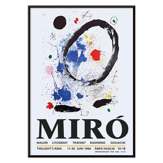
Twilight’s Ring Poster
Joan Miro · 2018 · Playful abstract poster of orbiting shapes and star-like marks on deep blue
Poster from 102 kr · Framed from 181.33 kr
Regular price From 68.00 krRegular price -
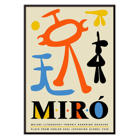
Parler Seul Poster
Joan Miro · 1948 · Playful abstract poster with floating symbols, bold lines, and primary color accents
Poster from 102 kr · Framed from 181.33 kr
Regular price From 68.00 krRegular price -
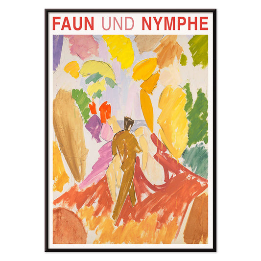
Faun and Nymphe Poster
Edvard Weie · 1941 · Expressive mythic poster pairing a faun and nymph in bold modernist color blocks
Poster from 102 kr · Framed from 181.33 kr
Regular price From 68.00 krRegular price -
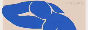
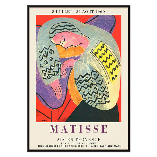
The Dream Poster
Henri Matisse · 1960 · Vibrant sleeping figure poster with flowing contours and bold, flat color shapes
Poster from 102 kr · Framed from 181.33 kr
Regular price From 68.00 krRegular price -
Le Concert Poster
Hulusi Mercan · 1960 · Energetic abstract poster of musical instruments with bold red blue and yellow shapes
Poster from 102 kr · Framed from 181.33 kr
Regular price From 68.00 krRegular price -
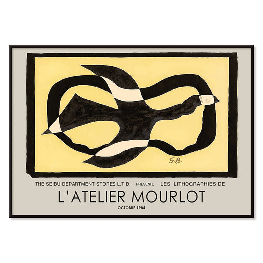
Bird passing through a Cloud Poster
George Braque · 1957 · Abstract bird poster drifting through a cloud with crisp black lines on warm yellow
Poster from 102 kr · Framed from 181.33 kr
Regular price From 68.00 krRegular price -
Female Artist Poster
Ernst Ludwig Kirchner · 1910 · Angular figure art print with bold black contours and high-contrast color fields
Poster from 102 kr · Framed from 181.33 kr
Regular price From 68.00 krRegular price -
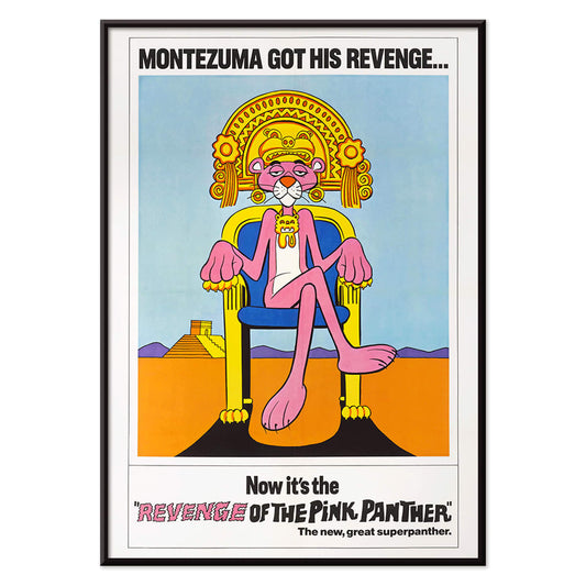
Revenge of the Pink Panther Poster
Unknown artist · 1978 · Playful Pink Panther movie poster with regal throne pose and bold retro colors
Poster from 102 kr · Framed from 181.33 kr
Regular price From 68.00 krRegular price -
Woman and Bird at Night Poster
Joan Miro · 1947 · Playful surrealist poster with midnight blue field and bright red and yellow signs
Poster from 102 kr · Framed from 181.33 kr
Regular price From 68.00 krRegular price -
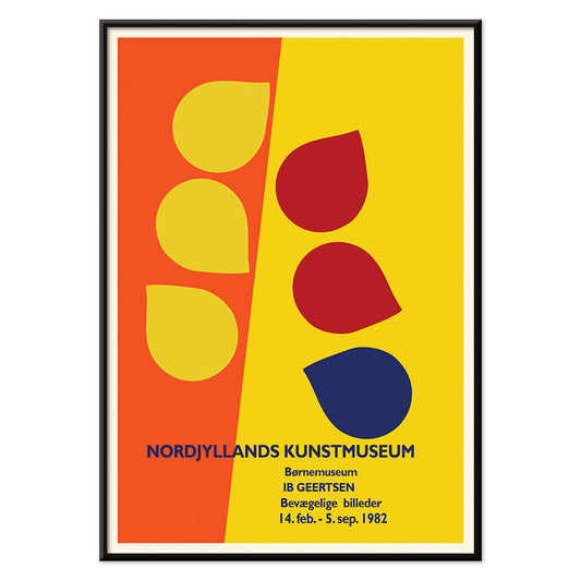
Ib Geertsen Poster
Ib Geertsen · 1982 · Vibrant geometric poster balancing bold primary blocks with crisp Scandinavian modernism
Poster from 102 kr · Framed from 181.33 kr
Regular price From 68.00 krRegular price -
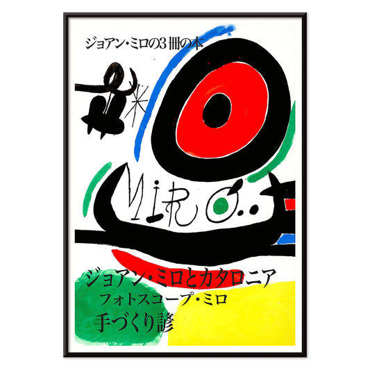
Joan Miro Osaka Poster
Joan Miro · 1970 · Playful abstract poster with calligraphic black forms and bright primary accents
Poster from 102 kr · Framed from 181.33 kr
Regular price From 68.00 krRegular price -
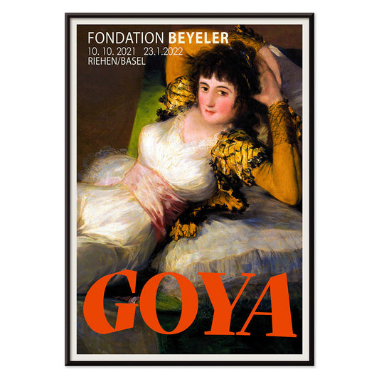
The Clothed Maja Poster
Francisco Goya · 1802 · Iconic reclining figure art print with crisp whites, green sash, and golden cushions
Poster from 102 kr · Framed from 181.33 kr
Regular price From 68.00 krRegular price -
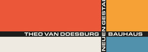
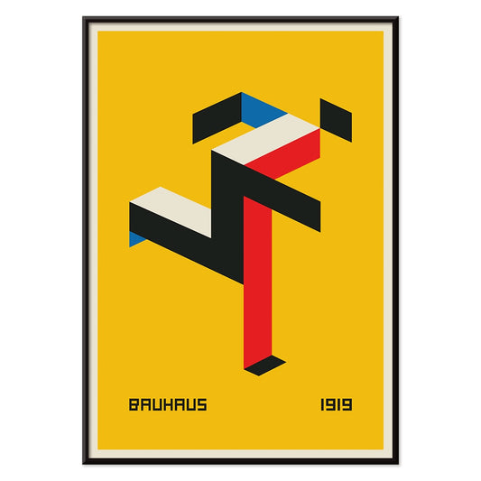
Bauhaus 20 Poster
Unknown artist · 1923 · Dynamic Bauhaus poster balancing primary blocks and crisp geometry on white space
Poster from 102 kr · Framed from 181.33 kr
Regular price From 68.00 krRegular price -
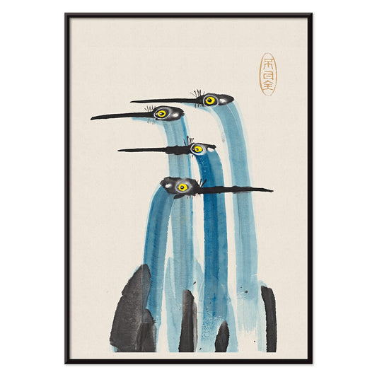
Blue Japanese Crane Poster
Unknown artist · 1889 · Serene Japanese crane art print with cool blue plumage and airy negative space
Poster from 102 kr · Framed from 181.33 kr
Regular price From 68.00 krRegular price -
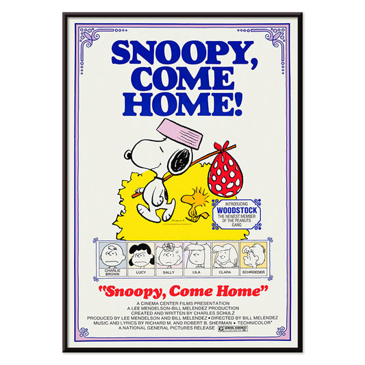
Snoopy come home Poster
Unknown artist · 1972 · Cheerful Snoopy and Woodstock poster with clean lines and bright primary colors
Poster from 102 kr · Framed from 181.33 kr
Regular price From 68.00 krRegular price -
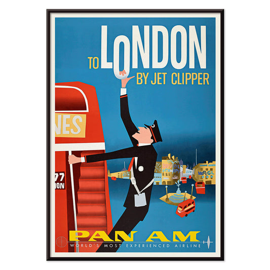
To London by Jet Clipper Poster
Unknown artist · 1955 · Mid-century London travel poster pairing a Pan Am stewardess with a red double-decker bus
Poster from 102 kr · Framed from 181.33 kr
Regular price From 68.00 krRegular price -
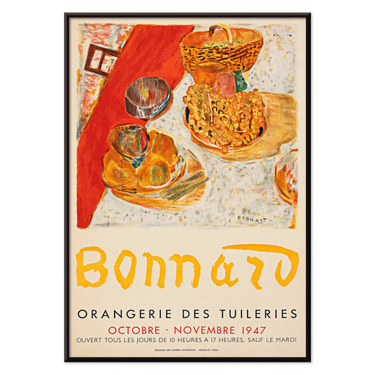
Exposition Bonnard Poster
Unknown artist · 1947 · Sunlit still life poster balancing bold color blocks and elegant exhibition typography
Poster from 102 kr · Framed from 181.33 kr
Regular price From 68.00 krRegular price -
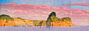
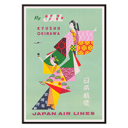
Kyushu-Okinawa Poster
Unknown artist · 1962 · Vibrant Japanese travel poster featuring traditional figures and bold island-inspired graphic shapes
Poster from 102 kr · Framed from 181.33 kr
Regular price From 68.00 krRegular price -
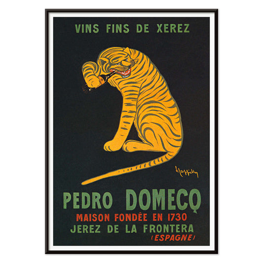
Xerez Pedro Domeco Poster
Leonetto Cappiello · 1930 · Iconic tiger poster leaping from deep black to advertise Xerez sherry
Poster from 102 kr · Framed from 181.33 kr
Regular price From 68.00 krRegular price -
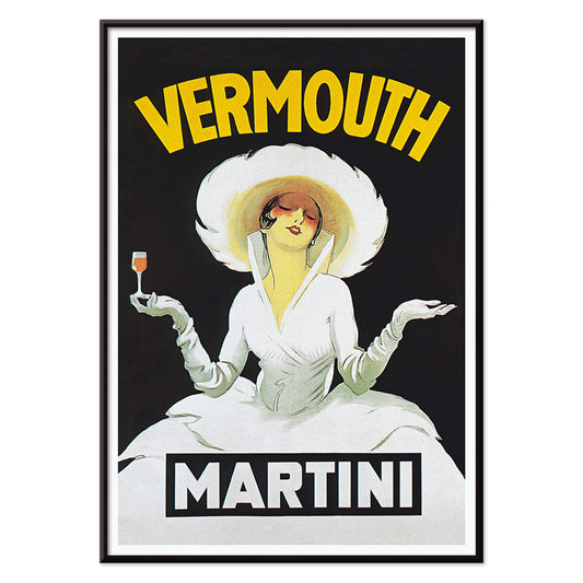
Vermouth Martini Poster
Marcello Dudovich · 1918 · Chic vermouth advertising poster featuring a poised woman in white and bold yellow accents
Poster from 102 kr · Framed from 181.33 kr
Regular price From 68.00 krRegular price -
Balsam Aperitif Poster
Jean d'Ylen · 1923 · Playful Art Deco poster of a chic woman beside an oversized cocktail glass
Poster from 102 kr · Framed from 181.33 kr
Regular price From 68.00 krRegular price


36/706 items
- Destroy this mad brute Poster
- The good neighbor of South America Poster
- Italy with Vatican City Poster
- Onions Poster
- Bec-Kina Poster
- Kohler Chocolat Poster
- Strawberry Thief Poster
- Tom Krojer Exhibition Poster Poster
- Ernst Kirchner Exhibition Poster
- El Comienzo Poster
- Parler Seul 2 Poster
- Twilight’s Ring Poster
- Parler Seul Poster
- Faun and Nymphe Poster
- The Dream Poster
- Le Concert Poster
- Bird passing through a Cloud Poster
- Female Artist Poster
- Revenge of the Pink Panther Poster
- Woman and Bird at Night Poster
- Bauhaus 20 Poster
- Blue Japanese Crane Poster
- Snoopy come home Poster
- To London by Jet Clipper Poster
- Kyushu-Okinawa Poster
- Xerez Pedro Domeco Poster
- Balsam Aperitif Poster
A Yellow Thread Through Art History
This collection is not about monochrome. It follows the way yellow behaves when it enters an image: as light, as warning, as ornament, as a quick lift of energy. In vintage poster culture it grabs attention from the street; in modern painting it becomes structure; in natural history it suggests pollen, rind, and sun-aged paper. Read these posters and prints as a vocabulary of warmth, from buttery highlights to sharp, electric notes that alter the temperature of wall art.
Gold, Citrus, and the Logic of Color
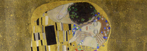
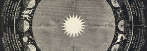
Few works show yellow as both luxury and technique as clearly as Gustav Klimt’s The Kiss (1907–1908), where metallic yellows behave like tesserae, turning paint into surface and surface into symbolism. At the opposite pole, Michel Eugène Chevreul’s Cercle chromatique treats hue as measurable information, a scientific diagram that still reads as decorative design. Together they explain why yellow persists across eras: it can signal opulence, illumination, or method, making a vintage art print feel both immediate and intellectually grounded.
Using Yellow Accents in Interior Decoration
In home decor, yellow works best when it has a job. A narrow hallway benefits from a small flare near a mirror; a kitchen welcomes yellows that feel citrus or grain-like; a study can take sharper, more analytic tones. Pair yellow posters with chalky whites, walnut, and linen for quiet warmth, or set them against deep greens and inky blues for contrast. For restraint and geometry, move between Minimalist and Abstract; for natural counterpoints, Botanical keeps the color tethered to stems, seed heads, and scientific observation.
Curating a Gallery Wall with Pattern and Structure
When building a gallery wall, think in rhythms: pattern, grid, then a single vivid note. William Morris’s Strawberry Thief (1883) brings textile density and a garden logic that softens modern furniture. Balance it with Piet Mondrian’s Composition in White, Red, and Yellow (1936), where yellow becomes a measured plane rather than atmosphere. Add controlled dynamism through Wassily Kandinsky’s Circles in a circle, Bauhaus exhibition (1923), a bridge between exhibition poster design and painting. To extend the mix, Advertising supports bolder typography, Bauhaus tightens the formal language, and Classic Art introduces quieter tonal anchors.
Why Yellow Feels So Present
Yellow is often dismissed as mere decoration, yet it is frequently a compositional strategy: guiding the eye, implying sunlight, or mapping a system. Hung with intention, a small yellow passage can make surrounding colors read cleaner or deeper, as if the room’s light has been adjusted without touching the lamps.