


- Onions Poster
- Radishes Poster
- Carrots Poster
- Butter Poster
- Rita Gaufres Poster
- Prunus avium Poster
- Huile Lesieur Poster
- Champion plum Poster
- The Vegetabull Poster
- Eat Greens for Health Poster
- Green Vegetables and herbs Poster
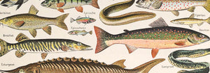
- Poissons Poster
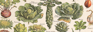
- Plantes Potageres Poster
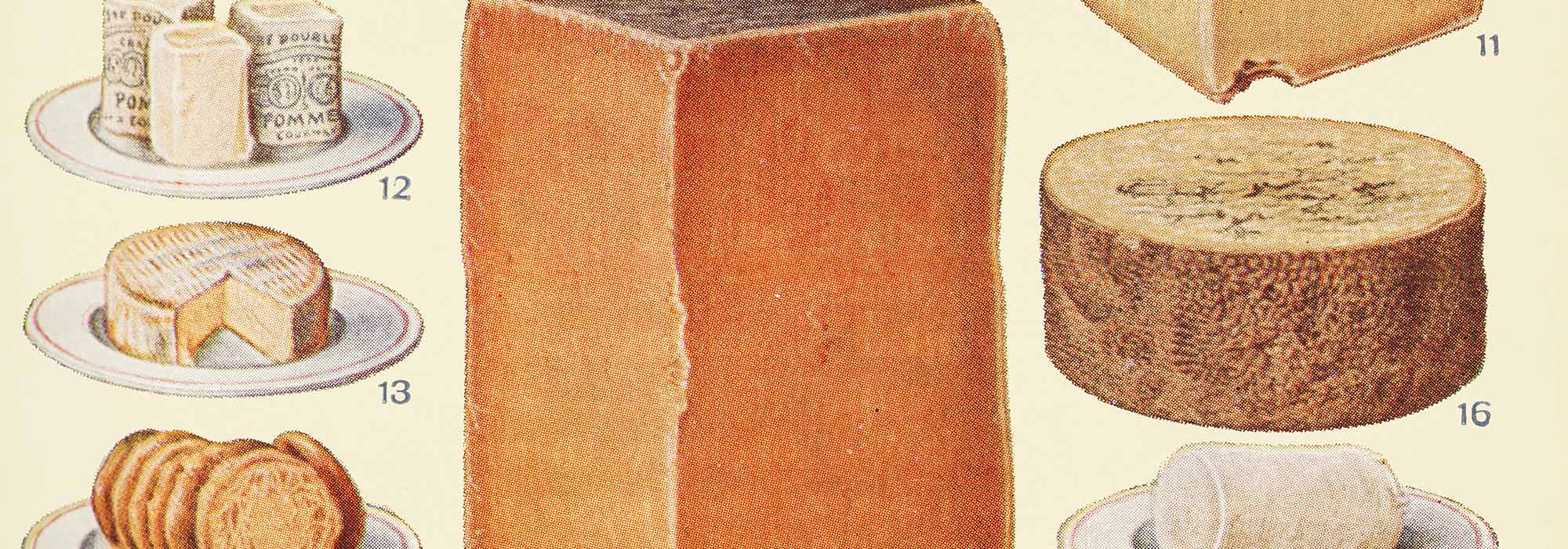
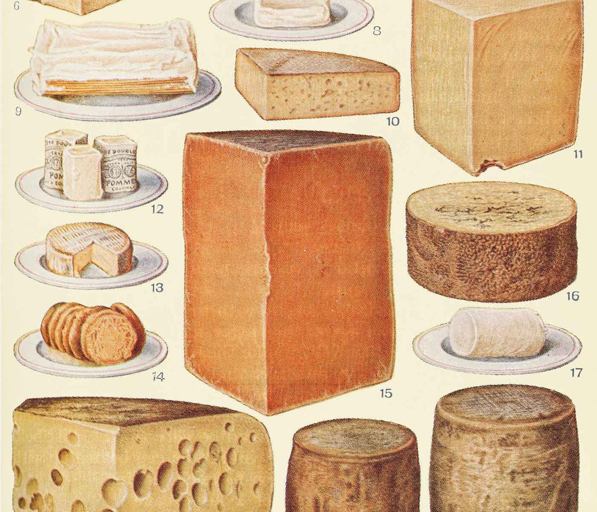
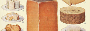
- Cheeses Poster
- Drink Coca Cola Poster
- Bananas Poster
- Tachyphone archeveque Poster
- Baked bread loaves 1 Poster
- Baked bread loaves 2 Poster
- Dig for Plenty Poster
- Persimmons Poster
- Avocado (Persea) Poster
- Lemons (Citrus Limon) Poster
- Bael (Aegle Marmelos) Poster
- Avocado (Persea) Poster
- Loquats (Eriobotrya Japonica) Poster
- Citrus Limonium Poster
- Turn that gas down Poster
- Chocolat Menier Poster
- Prunus Persica Poster
- Fragaria Poster
- Bunch of green grapes Poster
- Avocado Persea Poster
- No bestsellers in this collection
Where food becomes image
Kitchen posters sit at the crossing of appetite and archive: botanical plates, grocers catalogues, and advertising lithographs once pinned in markets and pantries. Food becomes subject and symbol, from citrus gloss and seed geometry to the quiet authority of labels. Read as vintage wall art, these prints carry practical clarity that holds its own beside tile grout, steel appliances, and working countertops.
Artists of the edible world
Naturalist illustration relied on disciplined observation and controlled colour, often built through watercolour washes over precise drawing. Ellen Isham Schutt’s Lemons (Citrus Limon) (1908) models rind and leaf with translucency rather than outline alone, a method that made scientific plates legible at a glance. In parallel, commercial poster design sharpened the edible into theatre. Huile Lesieur (1930) by Leonetto Cappiello uses silhouette, saturated reds, and emphatic type to make a pantry staple feel like a street spectacle. Lithography and chromolithography helped both worlds: soft gradients stayed printable, while contours remained crisp enough to read from across a room.
Placing kitchen prints like a designer
In a working kitchen, choose a poster that can handle visual noise from cabinets, handles, and hardware. Citrus and herb art prints lift north-facing light and pair naturally with pale oak, linen, and matte ceramics, while more graphic sheets echo the straight lines of modern joinery. If you like strong typography, connect this collection with Advertising and Minimalist. For more botanical continuity, pull companion pieces from Botanical, and for bar corners, the convivial palette of Alcool fits glass and metal. One larger print above a breakfast bench creates a focal point; a tighter cluster near the pantry turns waiting moments into looking.
Pairing, framing, and building a gallery wall
Good pairing depends on rhythm: alternate detailed specimens with bold graphic blocks so the eye can rest. Butter (1951) by Donald Brun is reduced almost to signage, and that simplification balances fussy crosshatching and dense captioning in older plates. For warmer tones, Chocolat Menier (1896) by Firmin Bouisset brings cocoa browns and a narrative figure that softens stone or concrete surfaces. Keep framing straightforward: simple wood, enamel, or consistent profiles from Frames prevent a small kitchen wall from feeling busy. To add breathing space, thread in a few calmer sheets from Black & White.
The quiet pleasure of useful images
Kitchen wall art often comes from images made to teach, persuade, or catalogue what people ate, and that original purpose still reads. A fruit study or a classic advertising print can make decoration feel tied to seasonality and routine rather than spectacle. In that sense, the gallery wall becomes a modest record of daily labour and taste, rendered as vintage print culture.