


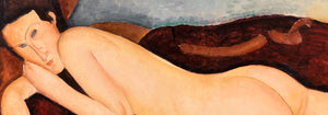


- Bird passing through a Cloud Poster
- Woman and Bird at Night Poster
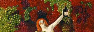
- La Paresse Poster
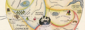
- Joyful Mountain Poster
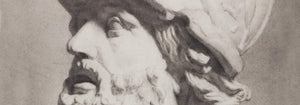
- Head of a Woman Poster
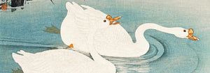
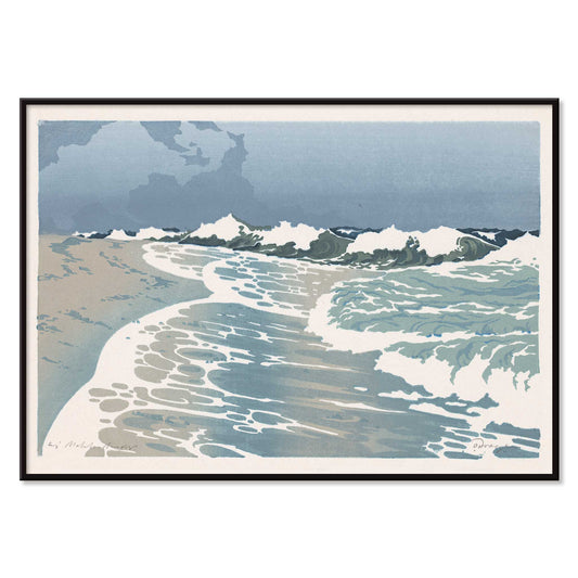
- Early Autumn in Urayasu Poster
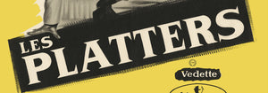
- Japanese Art Poster
- Lisbon Tramway 28 Poster
- Alfama Poster
- Lisbon Old City 1 Poster
- Lisbon Old City 2 Poster
- Black Leopard Poster
- Atlas of the Munsell color system Poster
- Voyage autour du monde 8 Poster
- Antique map of Barcelone Poster
- Real Club de Barcelona Poster
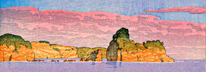
- Yoshino Poster
- Ryoson Poster
- Tomoe no yuki Poster
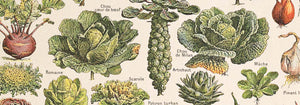
- Collection of leaves Poster
- Mount Fuji Poster
- London Underground Transport Poster
- Design for Dunhall Restaurant Poster
- Tsuru Poster
- Amaryllis Poster
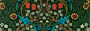
- Green Botanical pattern Poster
- Iceland Political Map Poster
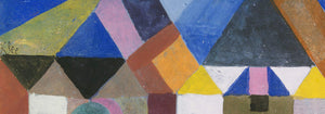
- Der Blaue Reiter Poster
- Climatic Chart of the World Poster
-
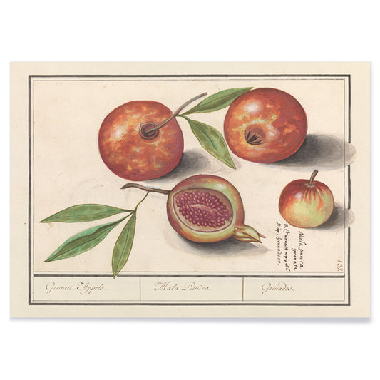
Pomegranate Poster
Anselmus Boëtius de Boodt · 1609 · Elegant pomegranate botanical print with glossy fruit, split seeds, and crisp green leaves
Poster from 102 kr · Framed from 181.33 kr
Regular price From 68.00 krRegular price -
Shell Poster
Julie de Graag · 1917 · Striking shell print with bold black curves and rhythmic hatch marks on beige
Poster from 102 kr · Framed from 181.33 kr
Regular price From 68.00 krRegular price -
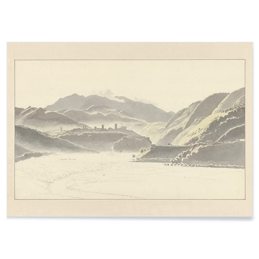
View of Cittaducale Poster
Josephus Augustus Knip · 1806 · Serene Italian landscape art print featuring a distant hillside town and soft neutral tones
Poster from 102 kr · Framed from 181.33 kr
Regular price From 68.00 krRegular price -
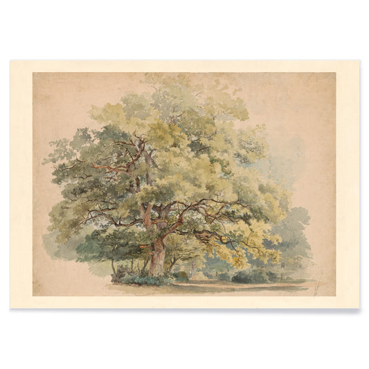
Lonely tree Poster
George Andries Roth · 1849 · Quiet landscape art print centered on a solitary tree in soft green light
Poster from 102 kr · Framed from 181.33 kr
Regular price From 68.00 krRegular price -
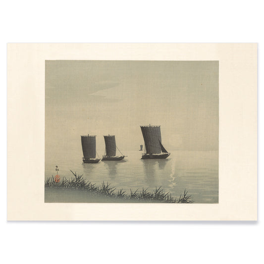
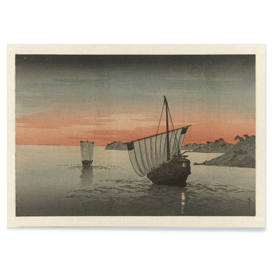
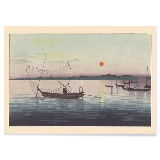
Fishing Boats Poster
Ohara Koson · 1910 · Quiet shin-hanga art print of three fishing boats drifting on calm evening water
Poster from 102 kr · Framed from 181.33 kr
Regular price From 68.00 krRegular price -
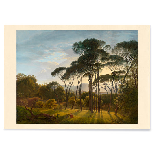
Umbrella Pines Poster
Hendrik Voogd · 1816 · Serene Italian landscape art print featuring umbrella pines, warm light, and distant blue hills
Poster from 102 kr · Framed from 181.33 kr
Regular price From 68.00 krRegular price -
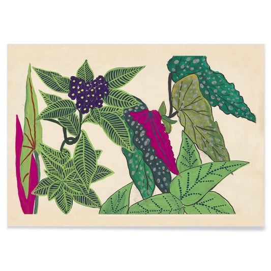
Leaves and fruits Poster
Paul Poiret · 1912 · Stylized leaves and fruit botanical print with bold green and purple forms on beige
Poster from 102 kr · Framed from 181.33 kr
Regular price From 68.00 krRegular price -
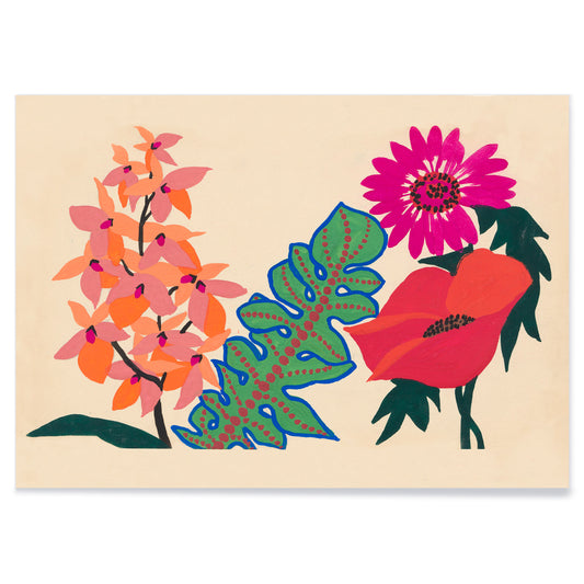
Leaves and flowers Poster
Paul Poiret · 1920 · Joyful floral poster with stylized leaves and blossoms on warm beige
Poster from 102 kr · Framed from 181.33 kr
Regular price From 68.00 krRegular price -
Two sailing ships Poster
Yoshimune Utagawa · 1850 · Serene ukiyo-e print of two sailing ships gliding across softly colored evening waters
Poster from 102 kr · Framed from 181.33 kr
Regular price From 68.00 krRegular price -
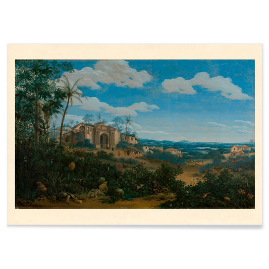
Olinda Poster
Frans Jansz Post · 1662 · Serene Olinda coastal panorama art print blending tropical greens with airy blue sky
Poster from 102 kr · Framed from 181.33 kr
Regular price From 68.00 krRegular price -
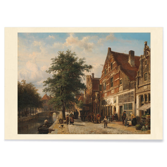
Town View Poster
Cornelis Springer · 1850 · Luminous Dutch cityscape art print with crisp façades, canal reflections, and strolling figures
Poster from 102 kr · Framed from 181.33 kr
Regular price From 68.00 krRegular price -
Ancient map of London Poster
Friedrich Arnold Brockhaus · 1899 · Detailed London map poster tracing the Thames and street grid in muted tones
Poster from 102 kr · Framed from 181.33 kr
Regular price From 68.00 krRegular price -
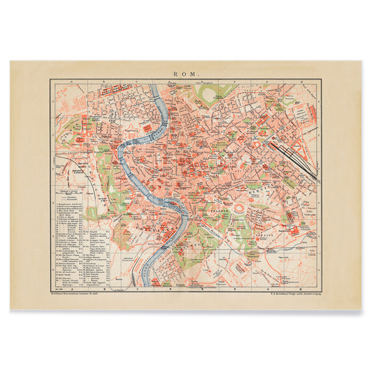
Ancient map of Rome Poster
Friedrich Arnold Brockhaus · 1883 · Detailed Rome map vintage print tracing the Tiber with crisp labeled districts
Poster from 102 kr · Framed from 181.33 kr
Regular price From 68.00 krRegular price -
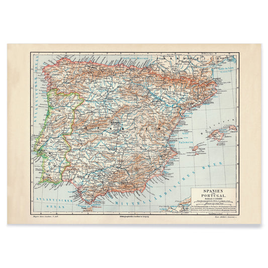
Ancient map of Spain Poster
Carl Diercke · 1905 · Detailed Iberian Peninsula vintage print with regional borders and coastal waters in soft beige and blue
Poster from 102 kr · Framed from 181.33 kr
Regular price From 68.00 krRegular price -
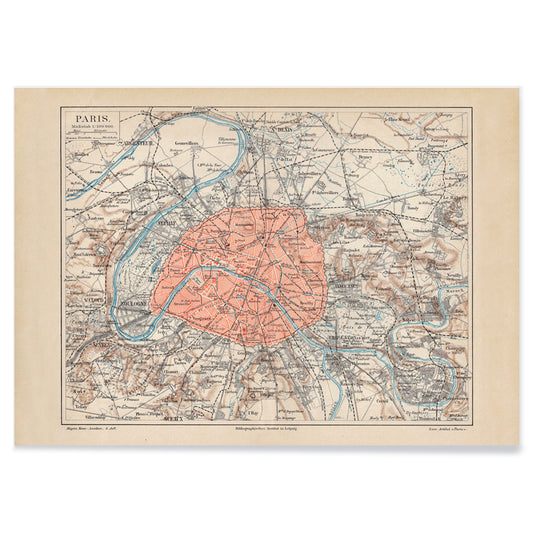
Ancient map of Paris Poster
Friedrich Arnold Brockhaus · 1894 · Detailed Paris city map vintage print with blue Seine and red boundaries
Poster from 102 kr · Framed from 181.33 kr
Regular price From 68.00 krRegular price -
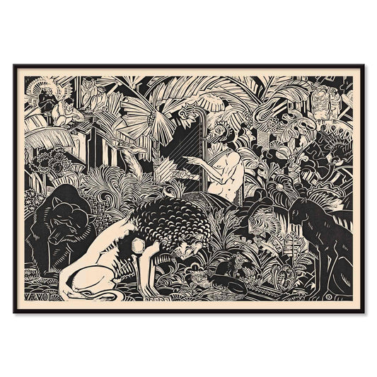
Orpheus Poster
Henri van der Stok · 1899 · Mythic Orpheus poster with a harpist calming birds and woodland animals
Poster from 102 kr · Framed from 181.33 kr
Regular price From 68.00 krRegular price -
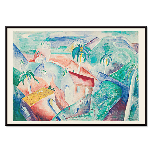
Cuban Landscape Poster
Paul Gaulois · 1926 · Sunlit Cuban landscape poster balancing lush greens, cobalt sky, and warm village tones
Poster from 102 kr · Framed from 181.33 kr
Regular price From 68.00 krRegular price -
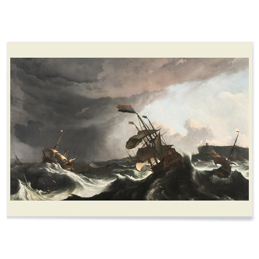
Warships in a Heavy Storm Poster
Ludolf Bakhuysen · 1690 · Dramatic storm-sea art print with warships battling towering waves beneath a broken sky
Poster from 102 kr · Framed from 181.33 kr
Regular price From 68.00 krRegular price -
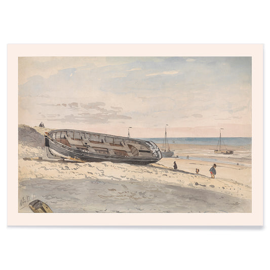
Barges on the beach Poster
Willem Anthonie van Deventer · 1870 · Quiet coastal art print with beached barges and muted beige grey blue tones
Poster from 102 kr · Framed from 181.33 kr
Regular price From 68.00 krRegular price -
Boats at sunset Poster
Ohara Matao · 1927 · Serene boats poster with red sun sinking over blue water in dusk haze
Poster from 102 kr · Framed from 181.33 kr
Regular price From 68.00 krRegular price -
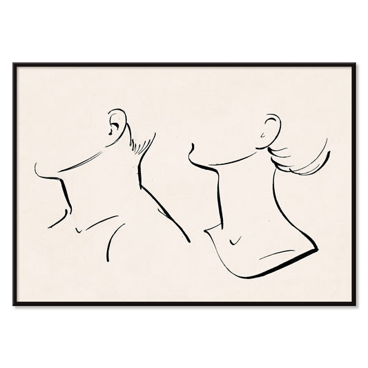
Neck Poster
Hans Borrebach · 1930 · Minimalist poster of intertwined neck profiles in black on warm beige
Poster from 102 kr · Framed from 181.33 kr
Regular price From 68.00 krRegular price -
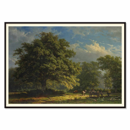
Bentheim Forest Poster
George Andries Roth · 1837 · Quiet woodland art print with travelers and horses beneath towering trees
Poster from 102 kr · Framed from 181.33 kr
Regular price From 68.00 krRegular price -
Mercury plays his flute Poster
Willem van Nieulandt · 1627 · Mythological art print of Mercury playing a flute as animals gather in a woodland
Poster from 102 kr · Framed from 181.33 kr
Regular price From 68.00 krRegular price -
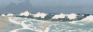
Sea Shore Poster
Orest Droegly · 1970 · Serene wave poster in layered blue bands with airy white foam
Poster from 102 kr · Framed from 181.33 kr
Regular price From 68.00 krRegular price -
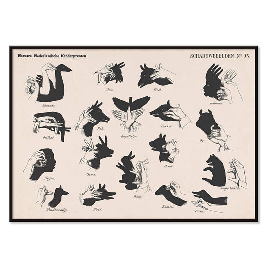
Shadow Hands Poster
George Lodewijk Funke · 1879 · Playful hand-shadow vintage print presenting puppet shapes in crisp black silhouettes
Poster from 102 kr · Framed from 181.33 kr
Regular price From 68.00 krRegular price -
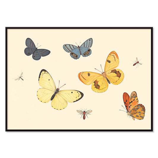
Five Butterflies Poster
Pieter Withoos · 1675 · Delicate insect print featuring five butterflies, a wasp, and two flies on pale ground
Poster from 102 kr · Framed from 181.33 kr
Regular price From 68.00 krRegular price -
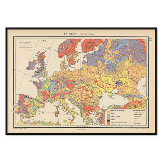
Europe geology map Poster
John George Bartholomew · 1942 · Detailed poster of Europe’s geology with layered colors and fine cartographic linework
Poster from 102 kr · Framed from 181.33 kr
Regular price From 68.00 krRegular price -
Plan of Barcelona and surroundings Poster
Unknown artist · 1890 · Barcelona map poster with sepia streets and coastal detail
Poster from 102 kr · Framed from 181.33 kr
Regular price From 68.00 krRegular price -
Barcelona satellite city map Poster
MORYARTY · 2026 · Barcelona satellite map poster with red district labels and coastline
Poster from 102 kr · Framed from 181.33 kr
Regular price From 68.00 krRegular price -
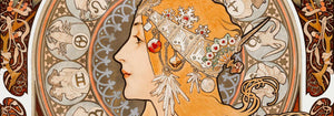
Café Rajah Poster
Henri Meunier · 1899 · Café Rajah poster frames a poised figure in warm Art Nouveau tones
Poster from 102 kr · Framed from 181.33 kr
Regular price From 68.00 krRegular price -
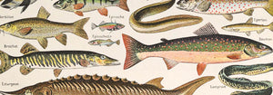
Freshwater fish chart Poster
Dr. W. Raschke · 1935 · Freshwater fish chart art print with detailed scientific studies
Poster from 102 kr · Framed from 181.33 kr
Regular price From 68.00 krRegular price -
Saltwater fish chart Poster
Dr. W. Raschke · 1909 · Detailed scientific print of saltwater fish on a warm beige chart
Poster from 102 kr · Framed from 181.33 kr
Regular price From 68.00 krRegular price -
Standing posture study Poster
N.C. Roms · 1906 · Scientific print of four standing posture studies on beige ground
Poster from 102 kr · Framed from 181.33 kr
Regular price From 68.00 krRegular price -
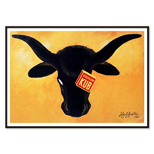
Bouillon Kub poster Poster
Leonetto Cappiello · 1931 · Bouillon Kub poster shows a black bull on orange ground
Poster from 102 kr · Framed from 181.33 kr
Regular price From 68.00 krRegular price -
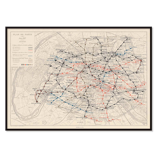
Plan de Paris et du chemin de fer métropolitain Poster
Louis Wuhrer · 1912 · Paris Metro poster with finely drawn routes and a historic city map
Poster from 102 kr · Framed from 181.33 kr
Regular price From 68.00 krRegular price


35/251 items
- No bestsellers in this collection
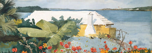
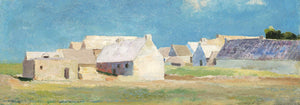
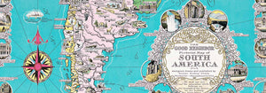
Why horizontal changes the room
Horizontal posters carry the quiet authority of a horizon line. The wide format slows the eye, letting an image unfold left to right rather than confronting you head-on. Historically, this proportion echoes travel panoramas, street-level placards, and cinema lobby displays, where distance and pacing mattered. In domestic spaces, a horizontal poster or art print reads as architectural: it extends a wall, ties furniture into one line, and makes negative space feel intentional. For a broader view of wide-format wall art across styles, it often sits naturally beside Landscape scenes or the crisp geometry found in Abstract work.
How wide-format images are built
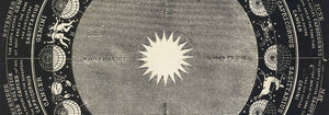
Wide compositions are engineered for balance. Designers distribute visual weight across corners and edges, using typography, a single bold motif, or a band of color to keep the center breathing. Early twentieth-century advertising posters leaned on lithography, where flat color areas and simplified shapes held up at a glance; see related approaches in Advertising. Photographic panoramas solve the same problem differently, guiding attention with lateral light and repeating forms. In Japanese print traditions, the scene is often cropped like a camera, turning bridges, waves, and streetlamps into sequences. A strong example of this lateral rhythm is Kawase Hasui’s Shiba Zoshigaya, where night tones and architecture lead the gaze in measured steps rather than a single focal hit.
Where horizontal wall art works best
In interiors, a horizontal print is most convincing where the room already draws a long line: above a sofa, headboard, sideboard, or a pair of bookcases. If the space is built on warm timber, linen, and chalky paint, choose vintage posters with softened inks and sandy grounds; for cooler rooms, higher contrast can sharpen the structure, especially from Black & White pieces. Minimal rooms benefit from a deliberate pause, which is why Minimalist images often work well in this format. Hang the bottom edge roughly 15–20 cm above the furniture, and aim for a width near two-thirds of what sits below to keep proportions calm.
Curating a gallery wall with an anchor piece
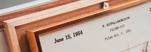
A horizontal poster can act as the anchor of a gallery wall, establishing a baseline that other frames respond to. Pair it with two narrower works from Vertical Posters to make a gentle triptych, or place a small photograph above it to add a second register without competing for width; Photo often provides that quieter, tonal counterpoint. Framing is especially noticeable on wide rectangles: a slim profile keeps the image expansive, while a deeper moulding adds gravity in rooms with heavy textiles. If you prefer a relaxed, modern edge, a magnetic option can suit wide prints; see Magnetic Frame. For a classic, architectural finish, Classic Frame reinforces the long line without over-decorating it.
A wide rectangle as visual pacing
The real advantage of horizontal wall art is pacing. It edits visual noise by connecting separate objects into one composed view: lamp, vase, books, then the image above, all sharing a single rhythm. A good horizontal vintage poster can soften a tall wall by introducing a low, steady beat; in a narrow corridor it can lengthen perspective and make transitions between rooms feel deliberate. Even when the subject is not a landscape, the format encourages long shadows, roomy skies, and extended patterns. In that sense, choosing a wide print is less about filling a space and more about deciding how you want a room to move.