
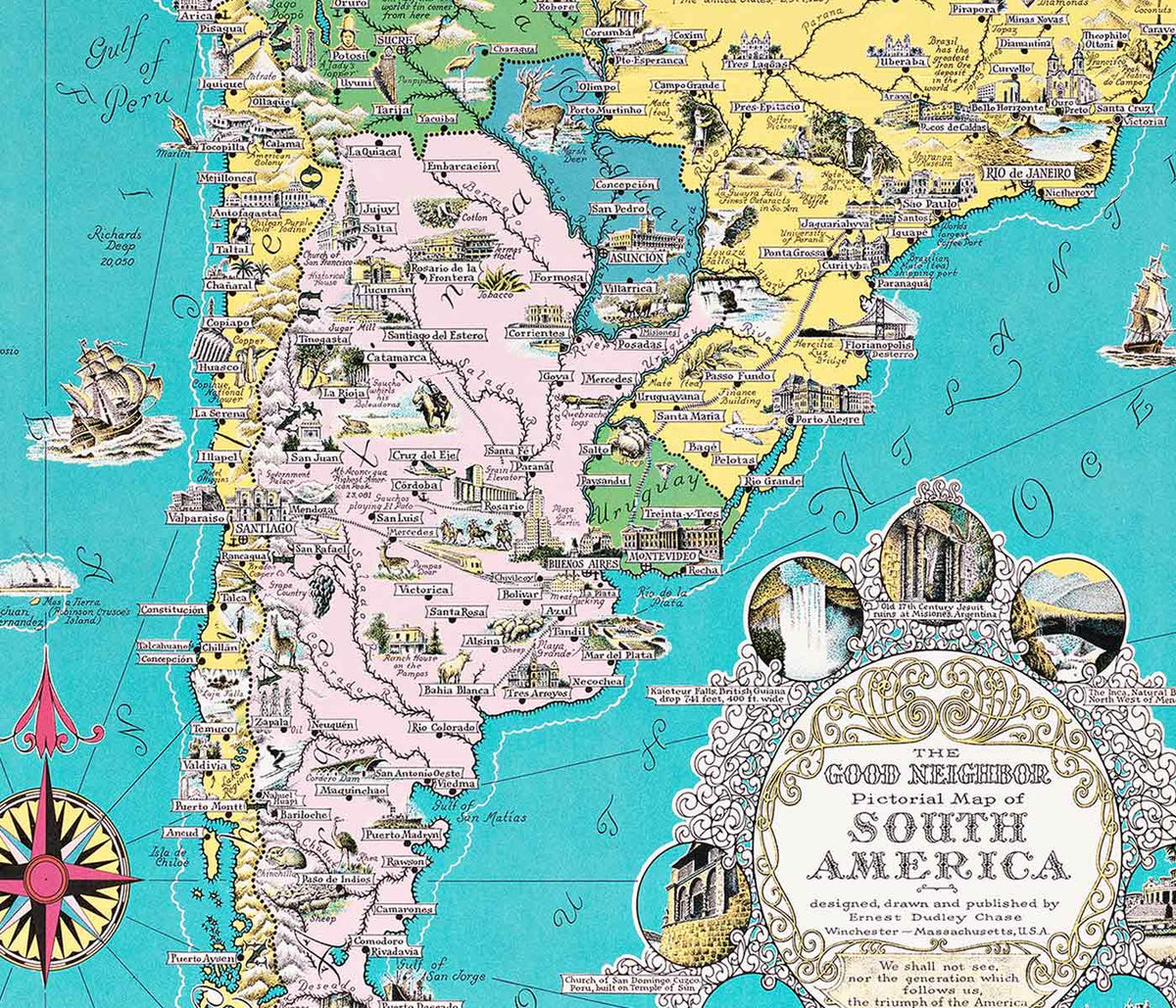


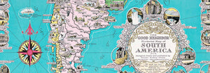


- The good neighbor of South America Poster
- Italy with Vatican City Poster
- Campanile di Pisa Poster
- British Overseas Airways Poster
- The New Yorker 2 Poster
- Petit Mentor Poster
- Silicon Valley Map Poster
- Japan the target Poster
- New York Minimalist Map Poster
- Minimalist Paris Map Poster
- Minimalist Valencia Map Poster
- Minimalist Madrid Map Poster
- Minimalist Buenos Aires Map Poster
- Minimalist Sao Paulo Map Poster
- Minimalist Rio de Janeiro Map Poster
- Minimalist Porto Map Poster
- Minimalist Lisbon Map Poster
- Minimalist London Map Poster
- Air France Poster
- Antique map of Barcelone Poster
- Courses of the Mississippi River Poster
- Valley of the Mississippi River Poster
- Map of Barcelona 2 Poster
- Minimalist Map of Barcelona Poster
- London Underground Transport Poster
- Iceland Political Map Poster
- Lac Des Quatre-Cantons Poster
- Geographical Guide to a Woman's Heart Poster
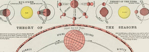
- Climatic Chart of the World Poster
- Map of Outer Space Poster
-
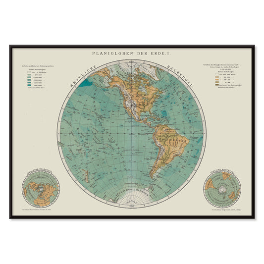
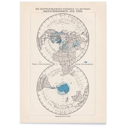
Planiglobes of the Earth I Poster
Institute of Liepzig · 1860 · Detailed hemispheric world map vintage print with crisp graticules and antique typography
Poster from 100.50 kr · Framed from 178.67 kr
Regular price From 67.00 krRegular price -
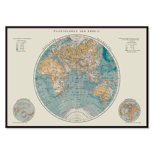
Planiglobes of the Earth II Poster
Institute of Liepzig · 1894 · Detailed double-hemisphere vintage print with antique cartography and fine latitude grid
Poster from 100.50 kr · Framed from 178.67 kr
Regular price From 67.00 krRegular price -
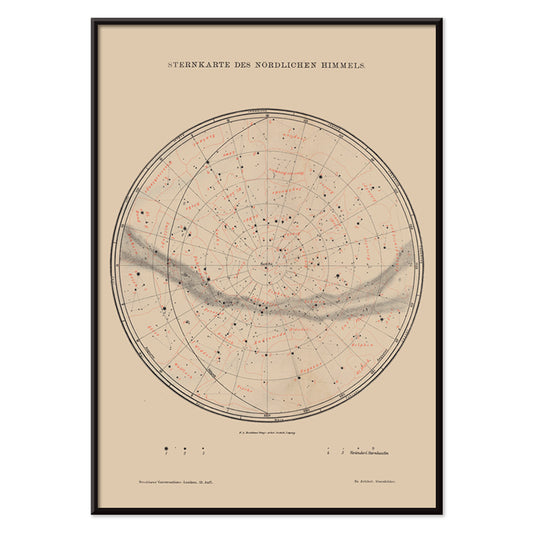
Nothern Sky Star Poster Poster
The Institute of Liepzig · 1910 · Detailed northern sky poster mapping constellations with crisp black lines and red accents
Poster from 100.50 kr · Framed from 178.67 kr
Regular price From 67.00 krRegular price -
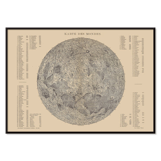
Map of the moon Poster
The Institute of Liepzig · 1903 · Detailed lunar map poster with crater labels and soft grey shading on beige
Poster from 100.50 kr · Framed from 178.67 kr
Regular price From 67.00 krRegular price -
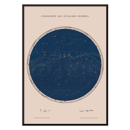
Southern Sky Star Poster Poster
The Institute of Leipzig · 1854 · Detailed southern sky print featuring crisp star points and fine constellation lines
Poster from 100.50 kr · Framed from 178.67 kr
Regular price From 67.00 krRegular price -
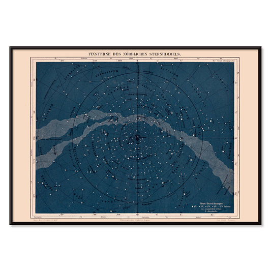
Milky Way North Hemisphere Poster
Institute of Leipzig · 1949 · Detailed northern sky poster charting constellations across a luminous Milky Way band
Poster from 100.50 kr · Framed from 178.67 kr
Regular price From 67.00 krRegular price -
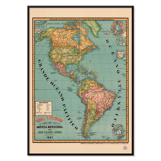
Septentrional and Meridional Poster
Josep Paluzie Lucena · 1899 · Detailed Americas vintage print with crisp labels and calm blue seas
Poster from 100.50 kr · Framed from 178.67 kr
Regular price From 67.00 krRegular price -
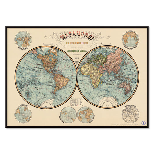
Mapamundi 2 Poster
Paluzie Lucena · 1938 · Detailed world map poster combining crisp black labels with soft beige and green tones
Poster from 100.50 kr · Framed from 178.67 kr
Regular price From 67.00 krRegular price -
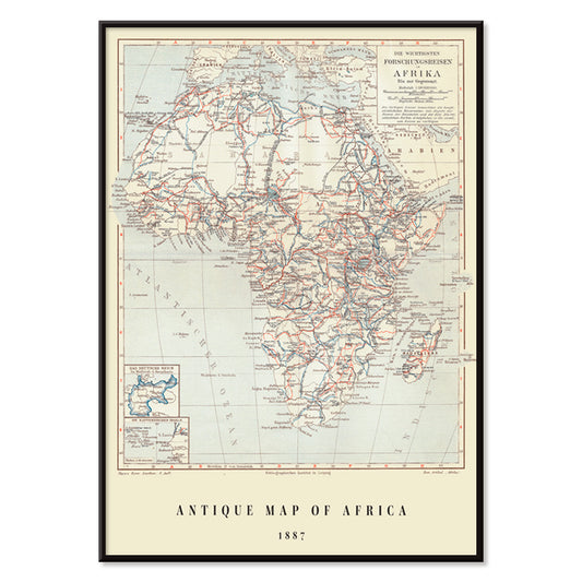
Antique map of Africa Poster
Institute of Liepzig · 1851 · Detailed Africa vintage print with gridded coordinates and dense place names
Poster from 100.50 kr · Framed from 178.67 kr
Regular price From 67.00 krRegular price -
Antique map of Scandinavia Poster
Institute of Liepzig · 1867 · Detailed Scandinavia vintage print with pastel regions, blue seas, and dense cartographic labeling
Poster from 100.50 kr · Framed from 178.67 kr
Regular price From 67.00 krRegular price -
Antique map of Italy Poster
Institute of Liepzig · 1887 · Classic Italy map poster with crisp borders, islands, and dense geographic labeling
Poster from 100.50 kr · Framed from 178.67 kr
Regular price From 67.00 krRegular price -
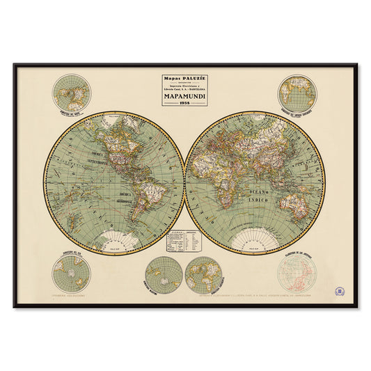
Mapamundi Poster
Josep Paluzie Lucena · 1900 · Detailed vintage world map poster with blue oceans and warm beige paper
Poster from 100.50 kr · Framed from 178.67 kr
Regular price From 67.00 krRegular price -
Antique map of Mexico Poster
Institute of Liepzig · 1887 · Detailed Mexico vintage print featuring crisp borders and classic atlas typography
Poster from 100.50 kr · Framed from 178.67 kr
Regular price From 67.00 krRegular price -
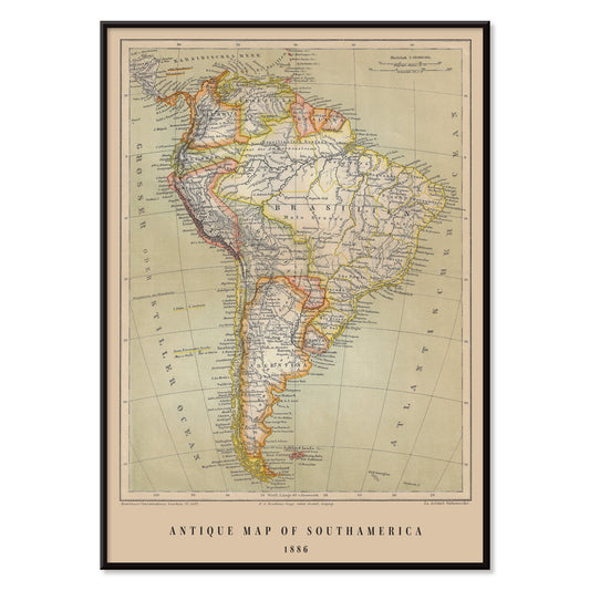
Antique map of Brasil Poster
Institute of Leipzig · 1886 · Detailed Brasil vintage print with crisp borders and period German typography
Poster from 100.50 kr · Framed from 178.67 kr
Regular price From 67.00 krRegular price -
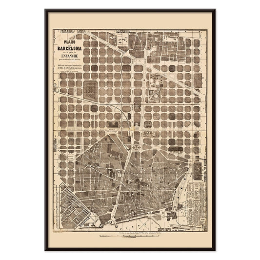
Plano de Barcelona 1870 Poster
Unknown artist · 1870 · Intricate Barcelona city plan vintage print with crisp street grid on warm beige
Poster from 100.50 kr · Framed from 178.67 kr
Regular price From 67.00 krRegular price -
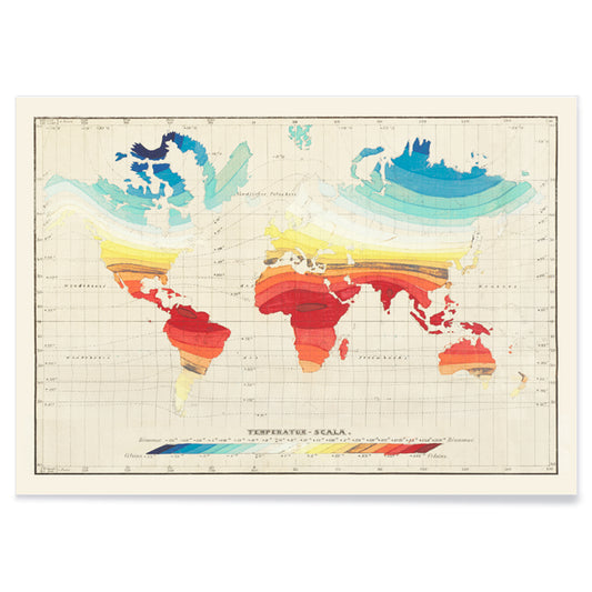
Temperature World Map Poster
Wilhelm Ebel · 1850 · Detailed temperature world vintage print mapping global climate zones with smooth gradient bands
Poster from 100.50 kr · Framed from 178.67 kr
Regular price From 67.00 krRegular price -
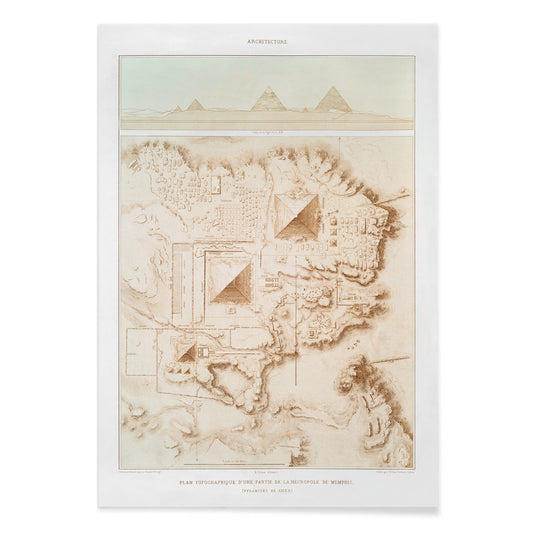
Topographic map of the Memphite Necropolis Poster
Émile Prisse d'Avennes · 1878 · Precise archaeological map vintage print charting pyramid fields and desert routes near Memphis
Poster from 100.50 kr · Framed from 178.67 kr
Regular price From 67.00 krRegular price -
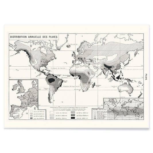
Annual Rainfall Distribution Poster
Emma Willard · 1954 · Monochrome rainfall map poster with contour bands and crisp scientific typography
Poster from 100.50 kr · Framed from 178.67 kr
Regular price From 67.00 krRegular price -
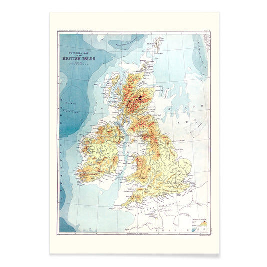
Gazetteer of the British Isles Poster
John Bartholomew · 1887 · Detailed British Isles vintage print balancing crisp labels with an atlas-like cartographic layout
Poster from 100.50 kr · Framed from 178.67 kr
Regular price From 67.00 krRegular price -
Up-to-date map of the world war Poster
Manila Shinbun-sha · 1942 · Detailed world war map poster with color coded routes and lively hand drawn icons
Poster from 100.50 kr · Framed from 178.67 kr
Regular price From 67.00 krRegular price -
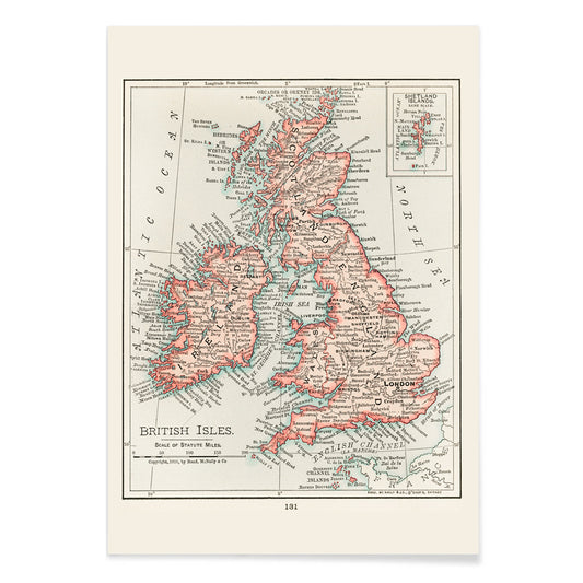
map of the British Isles Poster
Atlas of the World · 1900 · Detailed British Isles map poster with crisp borders and classic Edwardian typography
Poster from 100.50 kr · Framed from 178.67 kr
Regular price From 67.00 krRegular price -
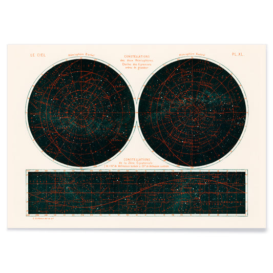
Constellations of the Two Hemispheres Poster
Amedee Guillemin · 1877 · Detailed celestial chart poster with twin hemispheres and crisp constellation linework
Poster from 100.50 kr · Framed from 178.67 kr
Regular price From 67.00 krRegular price -
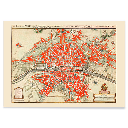
Ancient map of Paris Poster
Guillaume Delisle · 1721 · Detailed Paris city-plan vintage print with red highlights tracing the Seine and neighborhoods
Poster from 100.50 kr · Framed from 178.67 kr
Regular price From 67.00 krRegular price -
Ancient map of London Poster
Friedrich Arnold Brockhaus · 1899 · Detailed London map poster tracing the Thames and street grid in muted tones
Poster from 100.50 kr · Framed from 178.67 kr
Regular price From 67.00 krRegular price -
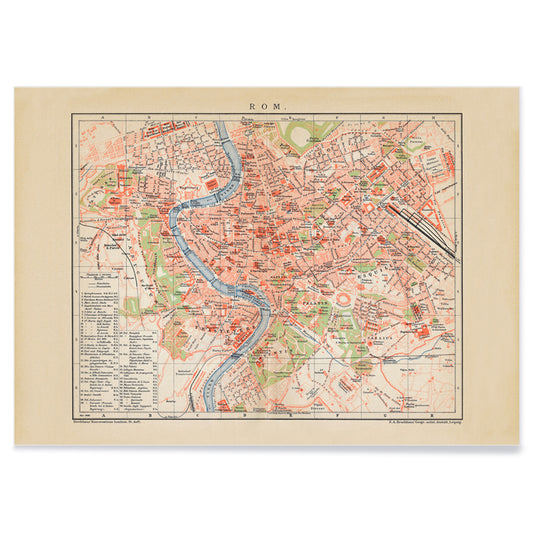
Ancient map of Rome Poster
Friedrich Arnold Brockhaus · 1883 · Detailed Rome map vintage print tracing the Tiber with crisp labeled districts
Poster from 100.50 kr · Framed from 178.67 kr
Regular price From 67.00 krRegular price -
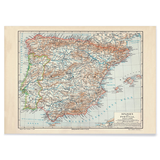
Ancient map of Spain Poster
Carl Diercke · 1905 · Detailed Iberian Peninsula vintage print with regional borders and coastal waters in soft beige and blue
Poster from 100.50 kr · Framed from 178.67 kr
Regular price From 67.00 krRegular price -
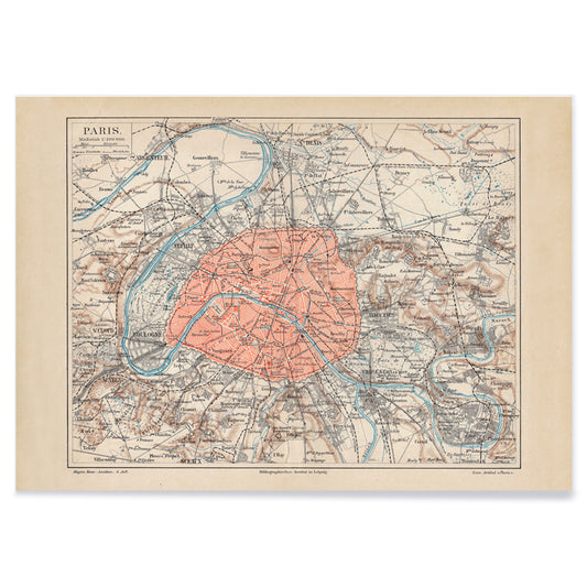
Ancient map of Paris Poster
Friedrich Arnold Brockhaus · 1894 · Detailed Paris city map vintage print with blue Seine and red boundaries
Poster from 100.50 kr · Framed from 178.67 kr
Regular price From 67.00 krRegular price -
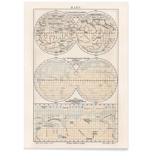
Map of Mars Poster
Friedrich Wilhelm Putzger · 1908 · Detailed Mars map vintage print with crisp coordinate grid and labeled surface regions
Poster from 100.50 kr · Framed from 178.67 kr
Regular price From 67.00 krRegular price -
Earth poles Poster
Friedrich Arnold Brockhaus · 1897 · Detailed polar regions vintage print with blue seas and precise black map lines
Poster from 100.50 kr · Framed from 178.67 kr
Regular price From 67.00 krRegular price -
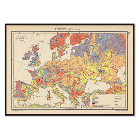
Europe geology map Poster
John George Bartholomew · 1942 · Detailed poster of Europe’s geology with layered colors and fine cartographic linework
Poster from 100.50 kr · Framed from 178.67 kr
Regular price From 67.00 krRegular price -
Plan of Barcelona and surroundings Poster
Unknown artist · 1890 · Barcelona map poster with sepia streets and coastal detail
Poster from 100.50 kr · Framed from 178.67 kr
Regular price From 67.00 krRegular price -
Barcelona satellite city map Poster
MORYARTY · 2026 · Barcelona satellite map poster with red district labels and coastline
Poster from 100.50 kr · Framed from 178.67 kr
Regular price From 67.00 krRegular price -
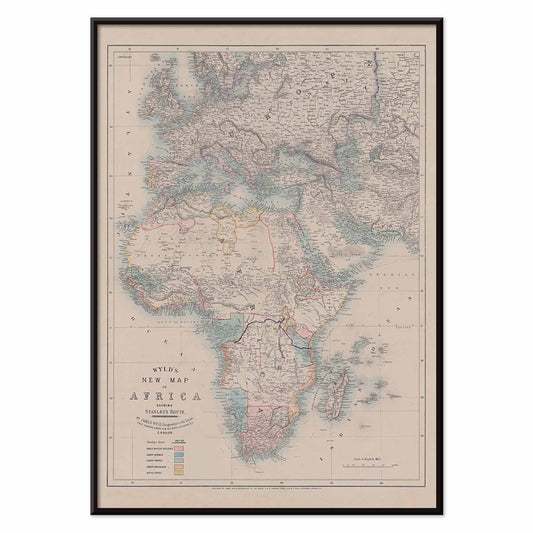
New map of Africa Poster
Wyld · 1887 · Vintage poster map in muted tones with detailed African coastlines
Poster from 100.50 kr · Framed from 178.67 kr
Regular price From 67.00 krRegular price -
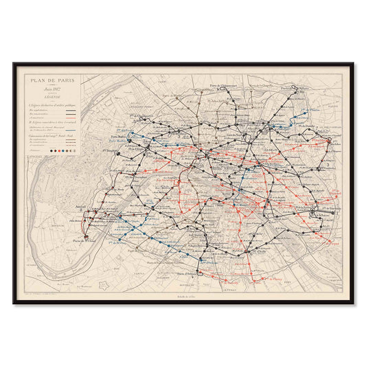
Plan de Paris et du chemin de fer métropolitain Poster
Louis Wuhrer · 1912 · Paris Metro poster with finely drawn routes and a historic city map
Poster from 100.50 kr · Framed from 178.67 kr
Regular price From 67.00 krRegular price


34/106 items
Cartography before it was an app
Long before GPS, maps shaped how people imagined distance, power, and possibility. Cartography was never only a neutral guide; every coastline, grid, and caption is a design decision. In vintage poster culture, maps sit at the crossroads of science and decoration, where the page must be legible at a glance yet rich enough to reward study. This collection gathers wall art that ranges from nineteenth-century survey logic to classroom charts and transport networks, all defined by the calm authority of measured lines and the intimacy of paper.
How maps became modern graphics
The most compelling map prints show technique as much as territory. Contour lines translate terrain into rhythm, hatching builds shadow without realism, and color bands carry climate or geology as if they were a painter’s palette. Harold Fisk’s Ancient Courses of the Mississippi River (1946) reads like a fingerprint archive, with river loops stacked in time rather than space. City plans push typography to the foreground: Whitbread new plan of London (1853) compresses streets into a dense weave, while London Underground Transport (1933) shows how modern life learned to think in nodes, lines, and simplified geography.
Using map posters as wall art at home
A map poster works best where you naturally pause: an entry, hallway, stair landing, or beside a desk, places that invite close reading. Hang slightly lower than standard gallery height so labels and symbols feel approachable. If your palette is restrained, the Blue and Black & White collections pair easily with ash wood, linen, and brushed steel. For a quieter graphic mood, add a companion from Minimalist. If you want the same sense of place with less information density, Landscape prints echo horizons and routes through light rather than coordinates.
Curating a gallery wall with cartography
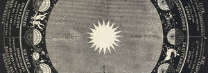
Map decoration looks most considered when the pacing varies. Start with one information-rich sheet, then offset it with a cleaner diagram or a spare study so the eye can rest. A city blueprint beside an airline route makes scale feel dramatic; a river study beside a chart makes color feel intentional. To keep the typography lively, borrow energy from Advertising posters, where lettering behaves like image. Two strong conversation pieces are Climatic Chart of the World (1893) by Levi Walter Yaggy, packed with instructional vignettes, and Map of Outer Space (1969) by Rand McNally & Co, which treats the solar system as a tidy classroom diagram. For borders, Frames helps keep the presentation crisp without competing with detail.
Why these prints keep pulling us back
Even the most functional map carries personality: what it emphasizes, what it omits, and how it claims authority through layout. That is why cartography sits comfortably beside Photo work or Abstract composition; it is a portrait of how a world was understood at a specific moment. As vintage wall art, maps offer both narrative and structure: a room gains a sense of direction, and the eye gets a surface built for slow reading.