




-

"Very nice Posters. The quality is amazing and we received it very quickly !"
-

"A shop to visit absolutely. Huge selection of posters. We spent more than an hour there !"
-

"Perfect to find gift. Price are very good. An they can frame and pack it on site"
About the Artist
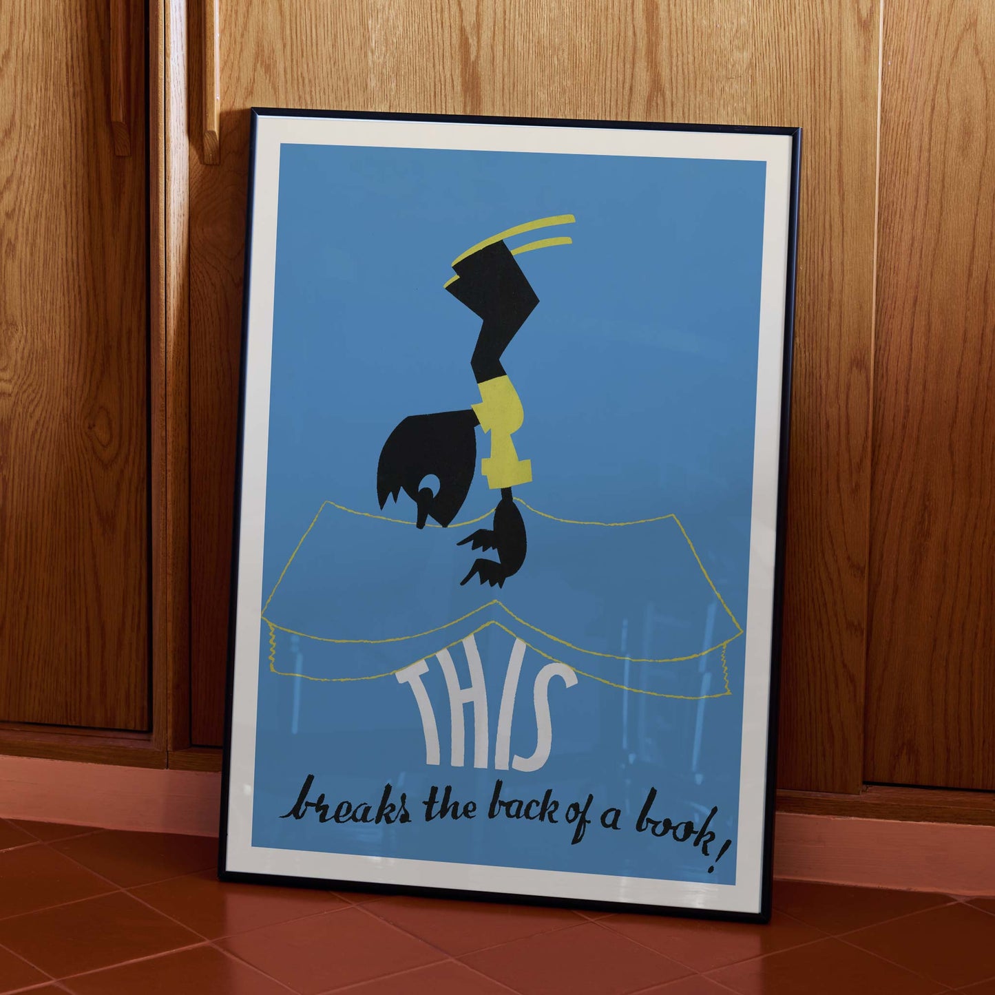
Arlington Gregg is the credited artist behind This breaks the back of a book!, a 1936 advertising poster about careful book handling. The title gives Gregg a memorable subject: an everyday library habit recast as physical comedy. Rather than relying on a long explanation, Gregg lets a short warning carry the purpose of the vintage poster. That economy serves readers searching for Arlington Gregg wall art, while the period lettering connects this fine art print to practical public communication. The vintage print preserves a public lesson in a playful form.
The Artwork
At its core, the poster serves one purpose: to discourage readers from forcing an open book flat and damaging its binding. The phrase This breaks the back of a book turns that warning into a scenario, giving the consequence a human scale instead of presenting a dry rule. Its 1936 date places the message in a period when printed notices carried guidance into public spaces, though we cannot identify the original venue from the image alone. Today, the work reads as vintage wall art with a literary subject, preserving an old-fashioned reminder that books deserve careful handling. The humor makes the instruction easy to recall without softening its point.
Style & Characteristics
The eye lands first on the tall black figure, bent headfirst above the open book like a hinged silhouette. Yellow bands mark the body and arc over the head, while a narrow yellow line traces the book across the blue ground. The pages are not filled with realistic detail; their outline acts as a stage for the large cream word THIS. Below, black hand-lettering delivers the rest of the title in a loose brush script. This contrast gives the vertical poster its visual joke, balancing a minimalist art print language with the tactile irregularity of vintage typography. Together, these accents keep the reading order unmistakable.
In Interior Design
In a compact study, place the vertical poster above a writing desk where its blue field can cool a wall of warm wood. A narrow black frame would echo the silhouette without competing with the cream lettering, while the generous margins preserve the clarity of the book-care message. From the desk chair, the reader can follow the image downward from the bent figure to THIS and then to the handwritten title. That sequence gives the room a literary focal point without turning the home decor into a formal gallery. For interior decoration, this fine art print brings a touch of 1930s graphic humor to a focused reading space.